
Living in a compact space often means every visual choice feels amplified. When the walls, furniture, and accessories all compete for attention, a single accent color can become the quiet thread that ties everything together. In this article you’ll discover seven ways to weave one hue through a studio‑type layout without overwhelming the room, while keeping comfort, functionality, and maintenance in mind.
1. Choose a Hue That Complements Your Base Palette
© 2026 AI Illustrator — Inspiration Only
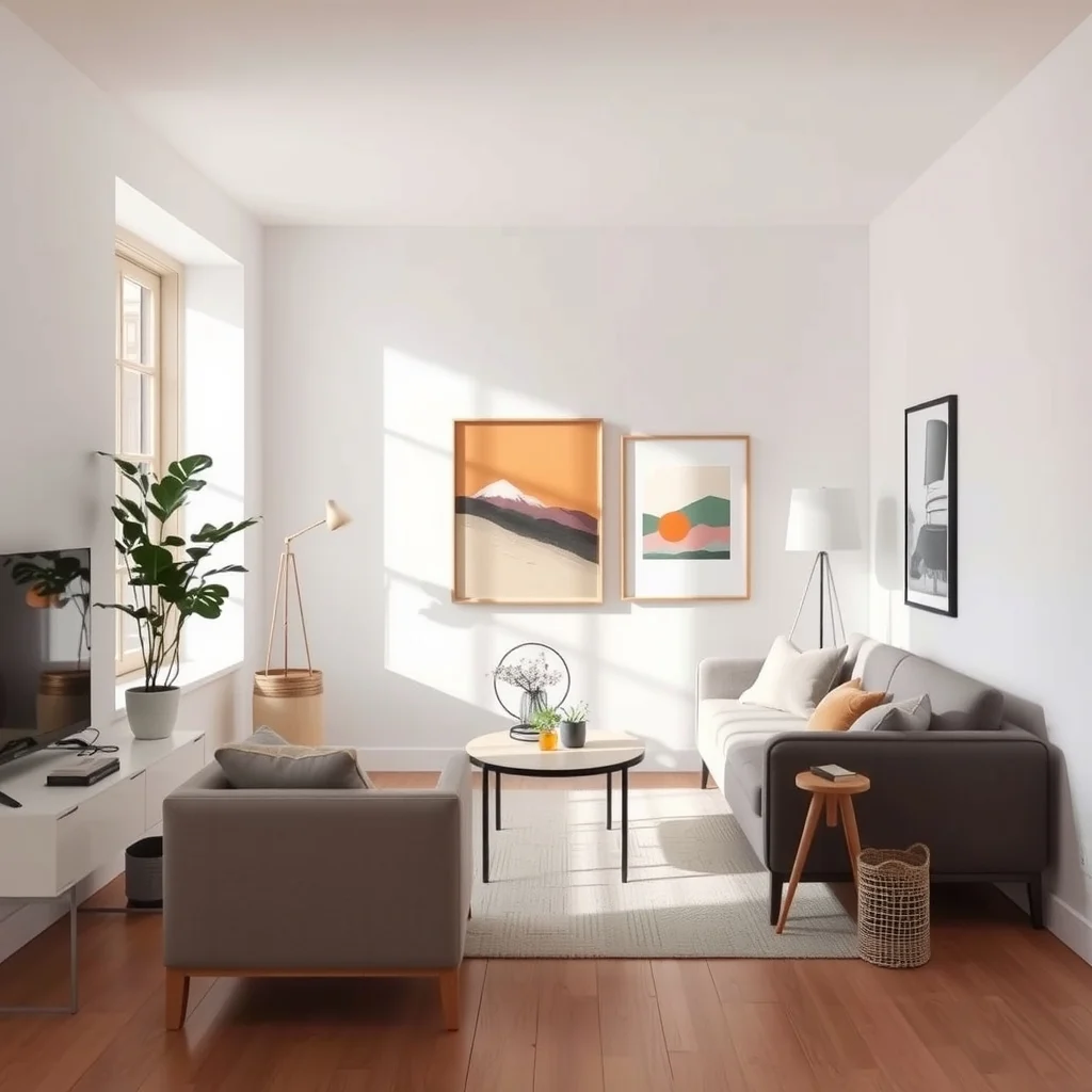
The first step is to look at the neutrals that already dominate your apartment—soft whites, warm greys, or muted beiges. Picking an accent that sits opposite these tones on the color wheel creates subtle contrast without clashing. For example, a muted teal works beautifully against a warm greige because the blue‑green undertone adds depth while still feeling calm. Once you’ve settled on a hue, test it with a small swatch on the wall or a fabric sample; natural light will reveal how the shade shifts from morning to evening. Selecting a color that harmonizes with the existing palette ensures that the accent feels intentional rather than forced, and it reduces the risk of the hue becoming overpowering in a limited space.
What’s Your Apartment Decor Style?
Answer these quick questions to discover your perfect decor vibe.
2. Anchor the Color in the Entryway
© 2026 AI Illustrator — Inspiration Only
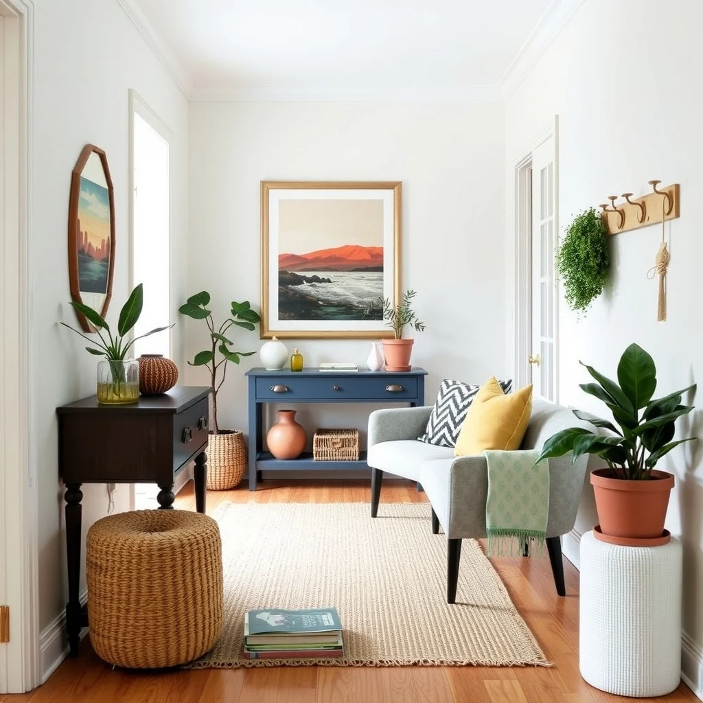
The moment you step inside sets the tone for the entire apartment. By placing the accent in the entryway—perhaps a painted console table drawer, a woven rug, or a set of wall hooks—you create an immediate visual cue that carries forward. A deep mustard drawer handle, for instance, catches the eye without demanding a whole wall of paint. This early touchpoint also guides visitors’ eyes toward the rest of the space, making subsequent accents feel cohesive. Just be mindful of traffic flow; choose items that are durable and easy to clean, as entryways endure the most wear.
3. Layer the Accent Through Textiles
© 2026 AI Illustrator — Inspiration Only
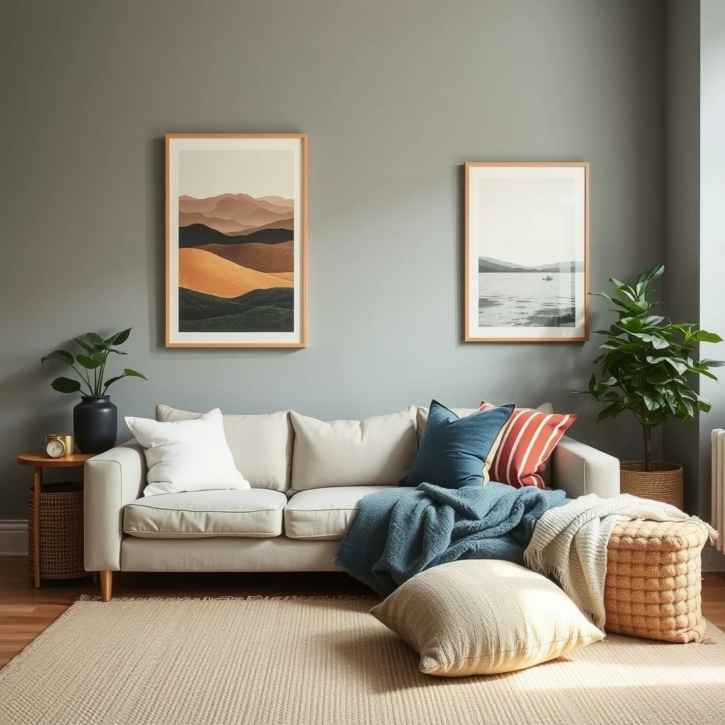
Textiles are the most forgiving way to repeat a color, especially when floor space is at a premium. A set of throw pillows in varying textures—linen, velvet, and boucle—can showcase the accent hue from different angles. A single teal pillow on a neutral sofa, paired with a patterned blanket that includes the same shade, adds visual interest without clutter. Because fabrics can be swapped seasonally, you retain flexibility as your tastes evolve. Opt for washable materials to keep maintenance simple, and consider a rug that incorporates the accent in a subtle pattern; it grounds the room while reinforcing the color story.
4. Use the Accent in Functional Fixtures
© 2026 AI Illustrator — Inspiration Only
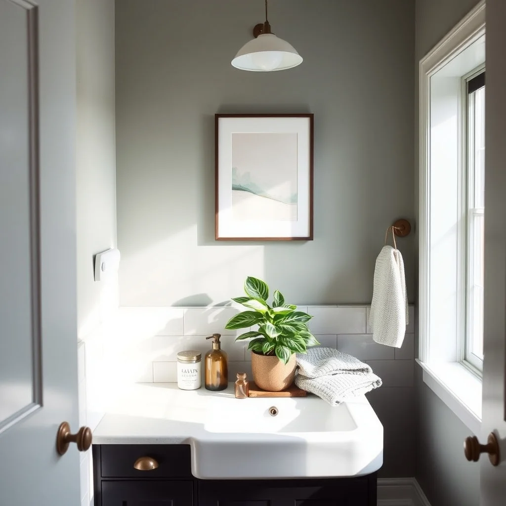
Functional pieces such as cabinet knobs, light switch plates, or bathroom fixtures double as design statements. Replacing standard brushed nickel handles with oil‑rubbed bronze knobs painted in the chosen hue instantly ties the kitchen island to the living area. In a small bathroom, a teal towel bar or a soap dispenser can echo the living‑room accent without adding visual noise. These updates are relatively inexpensive, yet they demonstrate a thoughtful attention to detail that makes the whole apartment feel curated. Just ensure the finishes are moisture‑resistant where appropriate, to avoid premature wear.
5. Highlight Architectural Details
© 2026 AI Illustrator — Inspiration Only
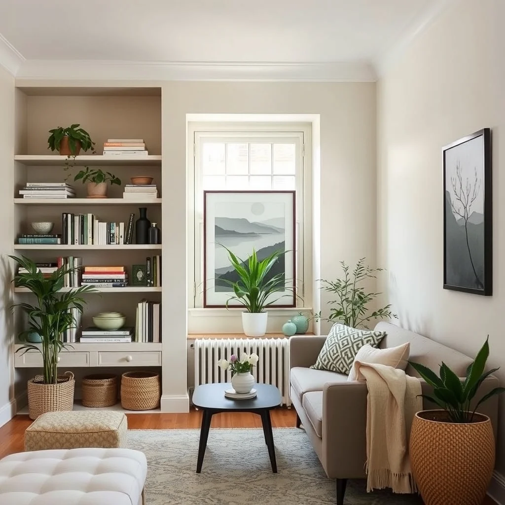
Even modest apartments often have built‑in shelves, a recessed niche, or a window frame that can serve as a subtle canvas. Painting the inside of a bookshelf back panel in the accent color creates a backdrop that makes books and decorative objects pop. Similarly, a slim stripe of paint on a window sill draws the eye upward, elongating the wall and adding a splash of personality. These touches work best when the painted surface is protected—consider a clear sealant on high‑traffic edges—to keep the color fresh over time.
6. Introduce the Hue Through Art and Wall Décor
© 2026 AI Illustrator — Inspiration Only
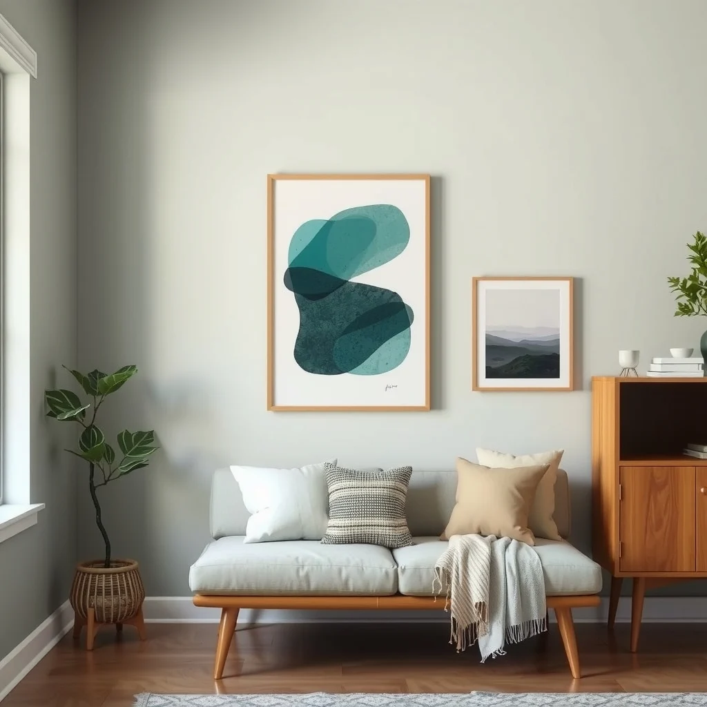
Wall art is a natural repository for a single accent. A framed print that features a splash of teal against a neutral background can anchor the color without demanding a full‑wall treatment. Choose pieces that incorporate natural elements—like a botanical illustration—so the hue feels organic rather than ornamental. If you prefer a more minimalist approach, a single canvas with a bold brushstroke in the accent shade can serve as a focal point. Position the artwork at eye level to maximize impact, and use a simple hanging system to keep the wall clean and uncluttered.
7. Keep the Color Consistent in Outdoor‑Facing Spaces
© 2026 AI Illustrator — Inspiration Only
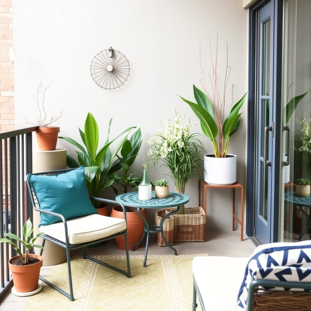
Balconies or small patios often get overlooked when planning an interior color scheme, yet they provide an opportunity to extend the accent outdoors. A teal outdoor cushion, a small metal side table painted in the same shade, or even a set of planters can echo the interior palette. Because these items face the elements, select weather‑resistant finishes and fabrics that can endure sun and rain. By mirroring the accent outside, you create a seamless transition that feels intentional and expands the perceived footprint of your home.
Frequently Asked Questions
© 2026 AI Illustrator — Inspiration Only
Can I use a bright accent color in a small apartment?
Yes, a bright hue can work if it’s balanced with plenty of neutral surroundings. Use the color sparingly on accessories or a single wall to avoid overwhelming the space.
How many pieces should I incorporate the accent color into?
There’s no strict rule, but aiming for three to five key items—such as a rug, pillows, and a piece of art—creates a cohesive look without clutter.
Is it better to paint a wall or use décor items for the accent?
Both approaches have merit. Painting a wall offers a bold statement, while décor items provide flexibility and easier updates. Consider your budget and willingness to change the look later.
What if the accent color clashes with my existing furniture?
If a clash occurs, introduce a neutral buffer like a white slipcover or a light‑colored coffee table. This softens the transition and lets the accent stand out without competing.
Do I need to match the exact shade in every item?
Exact matches aren’t necessary; variations in tone or saturation can add depth. The goal is harmony, not uniformity.
Final Thoughts
© 2026 AI Illustrator — Inspiration Only
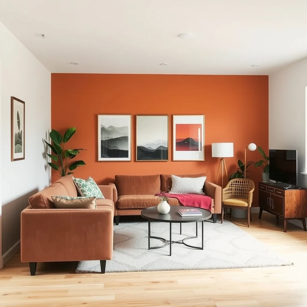
Applying a single accent color throughout a small apartment is less about boldness and more about strategic repetition. By selecting a hue that complements your base neutrals, anchoring it in high‑traffic zones, and weaving it through textiles, fixtures, and décor, you create a unified environment that feels larger and more intentional. Remember to balance visual interest with practicality—choose durable finishes and washable fabrics—to keep the space looking fresh for years to come.