
Walking through an unfurnished studio and trying to imagine how the living room, bedroom, and kitchen will feel together can feel overwhelming. A unified color palette is the quiet thread that ties each space into a single, comfortable home. In the following sections you’ll discover a step‑by‑step approach that moves from the big picture down to the finishing touches, so the colors you choose work harmoniously from the entryway to the bathroom.
1. Start with a Unifying Base Hue
© 2026 AI Illustrator — Inspiration Only
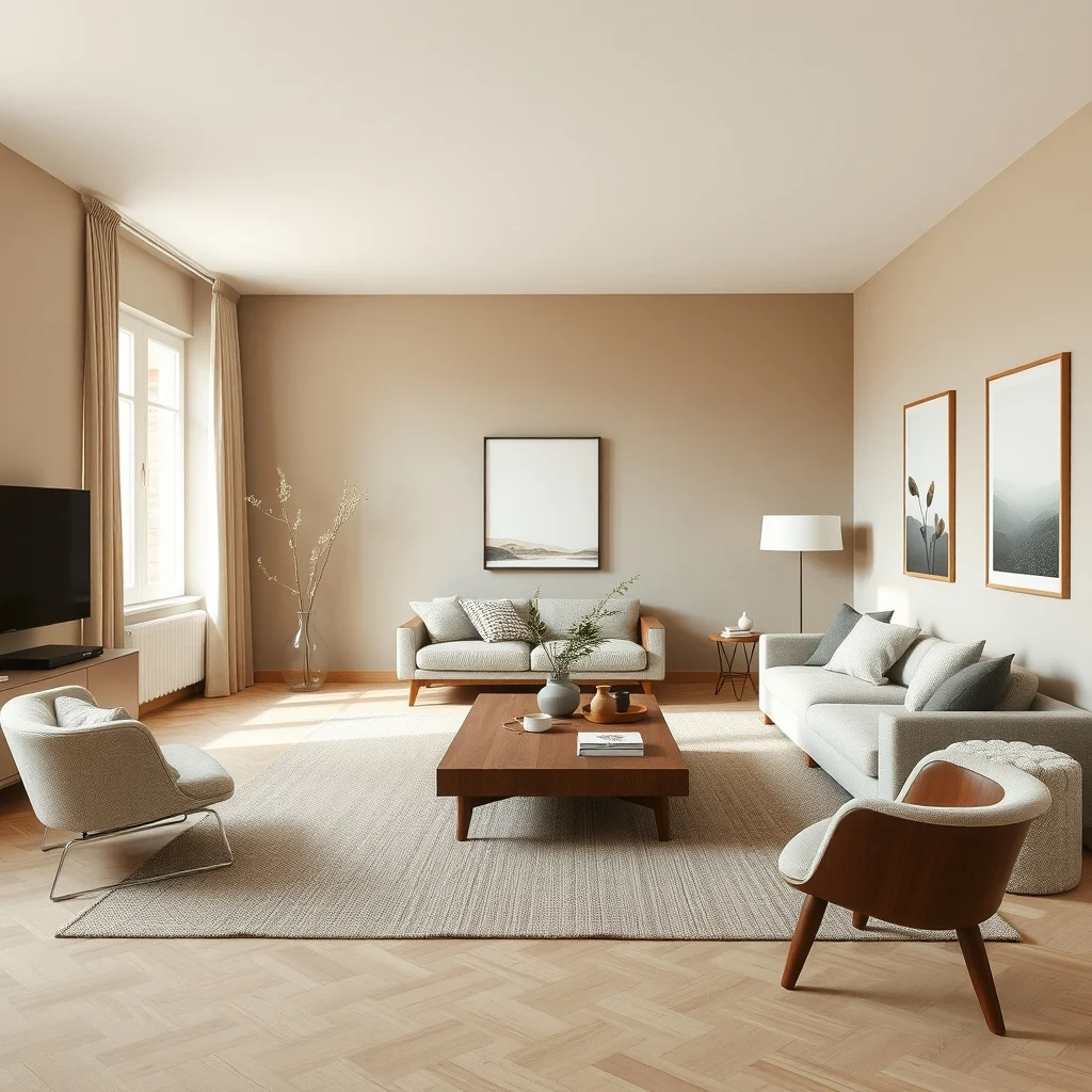
The first decision is the shade that will appear most often, whether on walls, large rugs, or major pieces of furniture. Selecting a neutral base—such as warm greige, soft dove gray, or muted olive—creates a calm backdrop that allows other colors to play without clashing. Because the base hue repeats in each room, the eye naturally perceives continuity, even when the functions of the spaces differ. When you apply the same paint or a coordinating wallpaper to all primary walls, you also reduce the visual noise that comes from too many competing tones. If you love a richer color, consider using it on a single accent wall in each room rather than covering every surface; this keeps the palette grounded while still giving each area its own personality.
What’s Your Apartment Decor Style?
Answer these quick questions to discover your perfect decor vibe.
2. Choose One or Two Accent Colors for Depth
© 2026 AI Illustrator — Inspiration Only
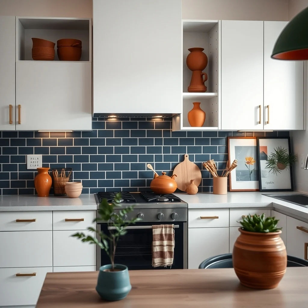
After establishing the base, introduce one or two complementary shades that will appear in smaller doses—think throw pillows, artwork, or kitchen backsplashes. A deep terracotta or a muted navy can add depth without overwhelming the neutral foundation. The key is to repeat these accents in a thoughtful way: a navy vase in the living room, a terracotta cushion on the bedroom sofa, and a matching backsplash tile in the kitchen. By limiting the number of accent hues, you avoid a chaotic look while still giving each room a point of interest. Remember that too many bold colors can compete for attention, so keep the overall proportion of accent to base roughly one‑third to two‑thirds.
3. Let Natural Light Guide Your Selections
© 2026 AI Illustrator — Inspiration Only
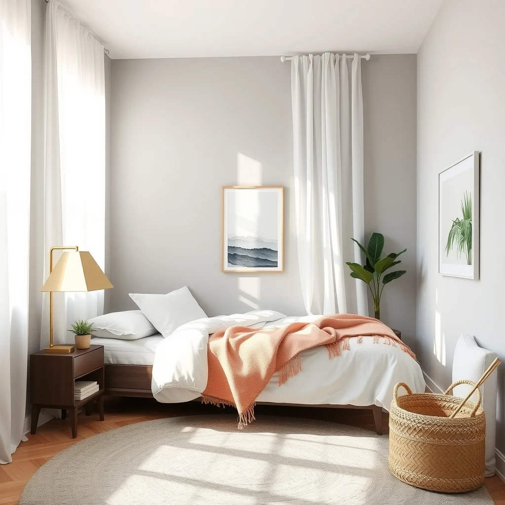
Sunlight changes the way paint and textiles appear throughout the day, so test swatches in the actual rooms before committing. A color that looks airy in a bright south‑facing living room may feel muted in a north‑oriented bedroom. When you notice that a particular shade loses its vibrancy in low light, pair it with reflective surfaces—such as brushed brass lighting fixtures or a glass coffee table—to bounce light back onto the walls. Conversely, if a hue feels too stark in a sun‑lit space, soften it with a linen curtain or a plush rug in a similar tone. Aligning your palette with the natural illumination of each area helps maintain visual balance across the apartment.
4. Use Materials and Textures to Bridge Color Gaps
© 2026 AI Illustrator — Inspiration Only
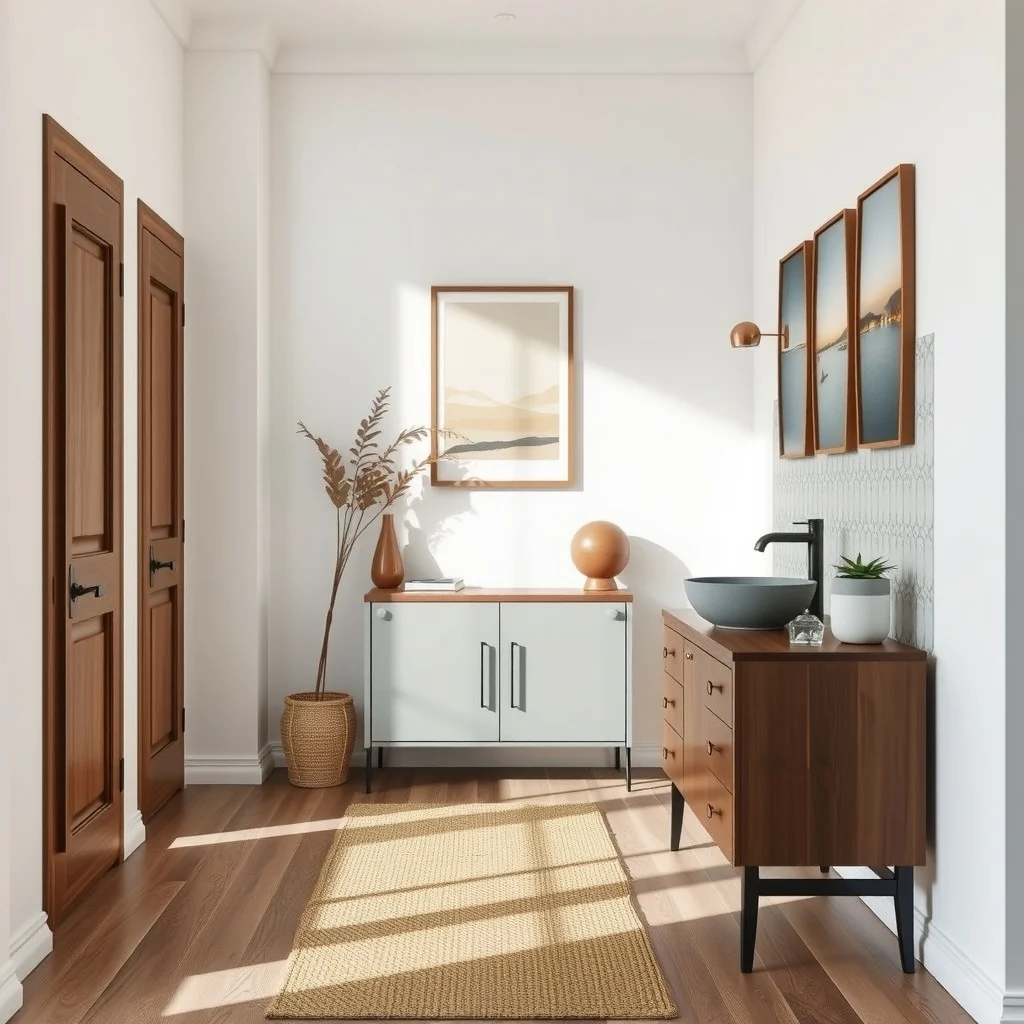
Even when two rooms share the same palette, differing textures can create a sense of flow. A walnut dining table, a woven jute rug, and a matte ceramic sink each carry the same underlying hue but speak through their surface qualities. By repeating material families—like wood, stone, or metal—you reinforce the color story while adding tactile interest. For example, a brushed copper lamp in the hallway echoes the copper handles on the kitchen cabinets, subtly linking the spaces. If a material feels out of place, consider a small accessory that introduces its texture without dominating the room, such as a woven basket for storage.
5. Anchor Each Space with a Signature Piece
© 2026 AI Illustrator — Inspiration Only
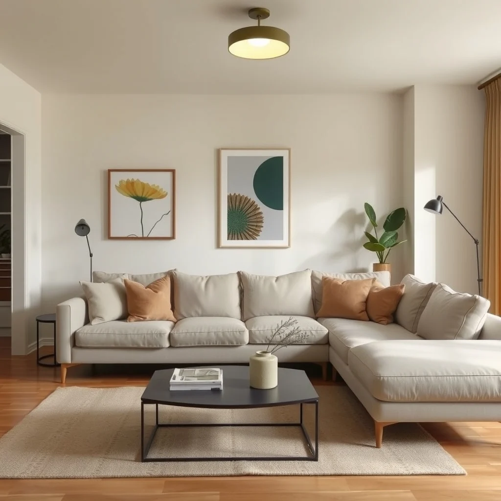
Every room benefits from a focal element that carries the palette forward. In the living area, a large upholstered sofa in the base hue can serve as the anchor; in the bedroom, a headboard upholstered in the same fabric extends that continuity. The kitchen might feature a bar stool upholstered in the chosen accent color, echoing the living room cushions. These signature pieces act as visual bridges, allowing the eye to travel from one room to the next without feeling jarring. Choose items that are durable and suited to the room’s traffic—so a sofa with a protective slipcover works well in a high‑use living room, while a soft linen headboard adds comfort to the bedroom.
6. Plan Transitions Between Public and Private Areas
© 2026 AI Illustrator — Inspiration Only
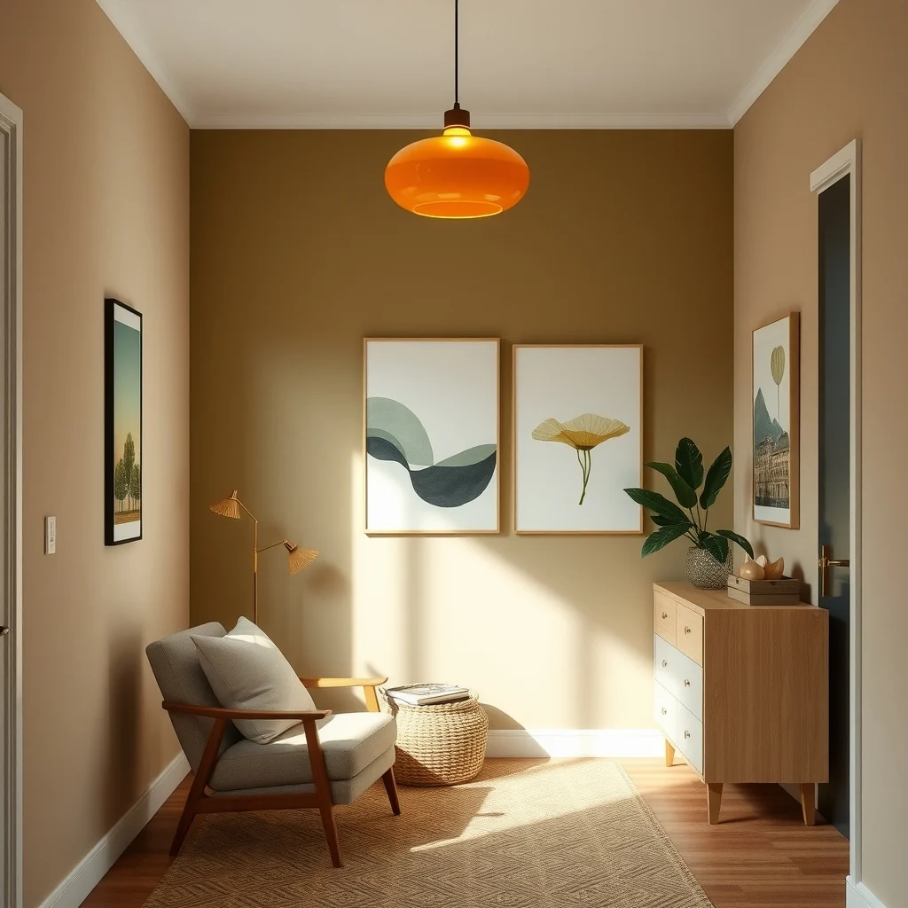
Open‑plan apartments often have a natural flow from the kitchen to the living room, while closed doors separate the bedroom and bathroom. Use transitional zones—such as hallways or entryways—to gradually shift the palette. A hallway rug that incorporates both the base and accent colors can soften the move from a bright kitchen to a more subdued bedroom. Similarly, a painted door in the same hue as the living room walls ties the spaces together without demanding extra décor. When a transition feels abrupt, add a narrow console table with a decorative bowl in the accent shade; this small step eases the visual journey.
7. Revisit and Refine Over Time
© 2026 AI Illustrator — Inspiration Only
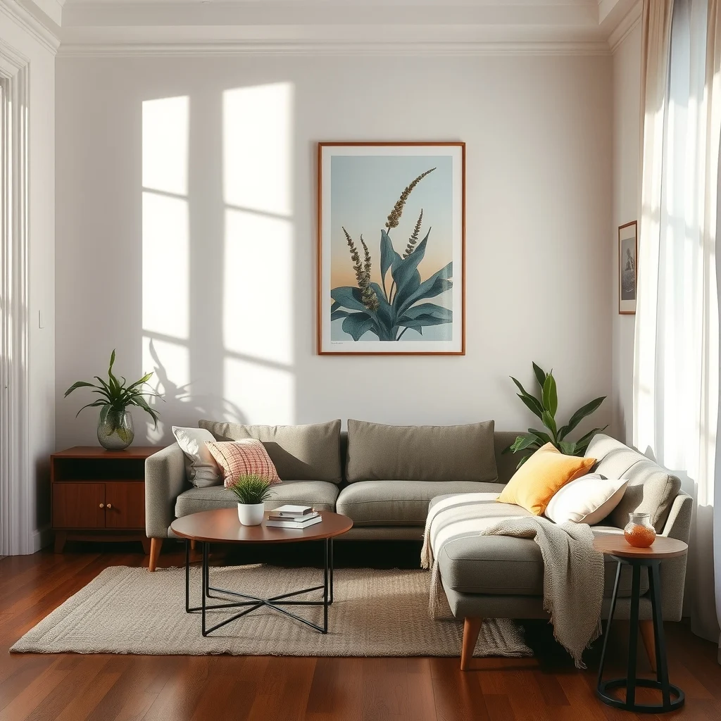
Living in a space gives you a chance to see how colors age with daily life. After a few months, you may notice that a particular accent fades faster due to sunlight, or that a texture attracts more wear. At that point, consider swapping out a cushion cover for a darker shade or replacing a rug with a more durable fiber. Small updates keep the palette feeling fresh without a full redesign. It also allows you to experiment—perhaps a new plant in a terracotta pot adds a subtle splash of color that complements the existing scheme. Treat the palette as a living element that evolves with your lifestyle.
FAQ
© 2026 AI Illustrator — Inspiration Only
How many colors should I use in an apartment palette?
Three to four colors work well: one base hue, one or two accent shades, and occasional neutrals for balance.
Can I use a dark color on all walls without making the space feel small?
Yes, if you pair a dark wall with plenty of light‑reflecting finishes, such as white trim, metallic fixtures, and layered lighting. The contrast creates depth while keeping the room feeling open.
What’s the best way to test paint colors in a small apartment?
Apply large swatches on opposite walls and observe them at different times of day. This reveals how the color reacts to both natural and artificial light, helping you choose a shade that works throughout the day.
How do I incorporate patterns without breaking the cohesive look?
Use patterns that feature the same palette colors, such as a geometric rug that repeats the base and accent hues. This ties the design together while adding visual interest.
Is it okay to mix matte and glossy finishes?
Mixing finishes adds texture and helps differentiate surfaces, but keep the colors consistent. A matte wall paired with a glossy countertop in the same hue creates a subtle contrast that feels intentional.
Final Thoughts
© 2026 AI Illustrator — Inspiration Only
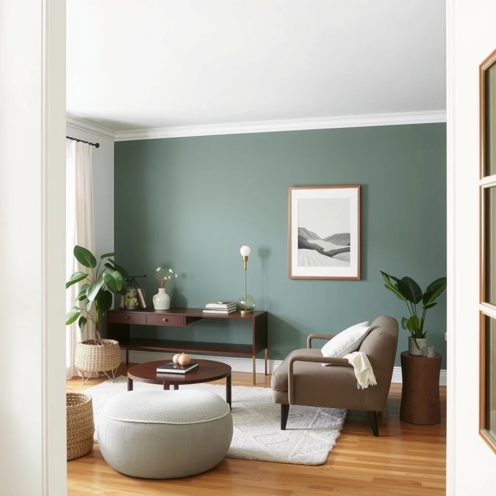
Creating a cohesive color palette for an entire apartment is less about strict rules and more about thoughtful repetition and balance. By starting with a unifying base, limiting accent shades, respecting natural light, and using texture as a connective tissue, you can craft a home that feels intentional from the moment you step through the front door. Remember that the palette can evolve as your needs change, so allow room for small adjustments. With these principles in place, the colors you choose will support a harmonious, welcoming environment that reflects your personal style.