
Living in a compact apartment often means every square foot must feel intentional, and the color palette sets the tone for how space is perceived. Warm neutrals—think soft greiges, muted terracotta, and gentle olive—provide a backdrop that feels both refined and inviting, allowing furniture and accessories to shine without overwhelming the room. In this article you’ll discover seven ways to weave these hues into walls, textiles, wood, lighting, storage and personal details, creating a cohesive designer aesthetic that feels lived‑in and comfortable.
1. Warm Greige Foundations
© 2026 AI Illustrator — Inspiration Only
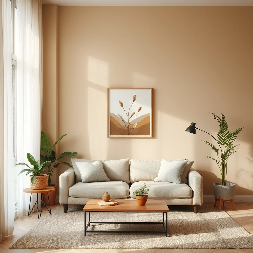
Starting with the walls is the most straightforward way to establish a warm neutral base. A greige that leans toward beige rather than a cool gray will catch the natural daylight in a way that adds subtle depth without the starkness of pure white. When choosing the exact shade, test large swatches on opposite walls; the side that receives morning sun will appear brighter, while the evening‑lit side will reveal the undertone’s warmth. Selecting a paint with a low‑sheen finish helps hide minor imperfections and reduces glare, which is especially useful in smaller rooms where light bounces around more.
What’s Your Apartment Decor Style?
Answer these quick questions to discover your perfect decor vibe.
Once the walls are set, you can let the color work with the room’s architecture. Crown molding painted in the same greige creates a seamless transition between ceiling and wall, while a slightly darker shade on a feature wall adds visual interest without breaking the palette. The key is to keep the contrast subtle—an undertone shift of two to three shades is enough to define spaces such as a living area versus a dining nook.
2. Layered Textiles for Softness
© 2026 AI Illustrator — Inspiration Only
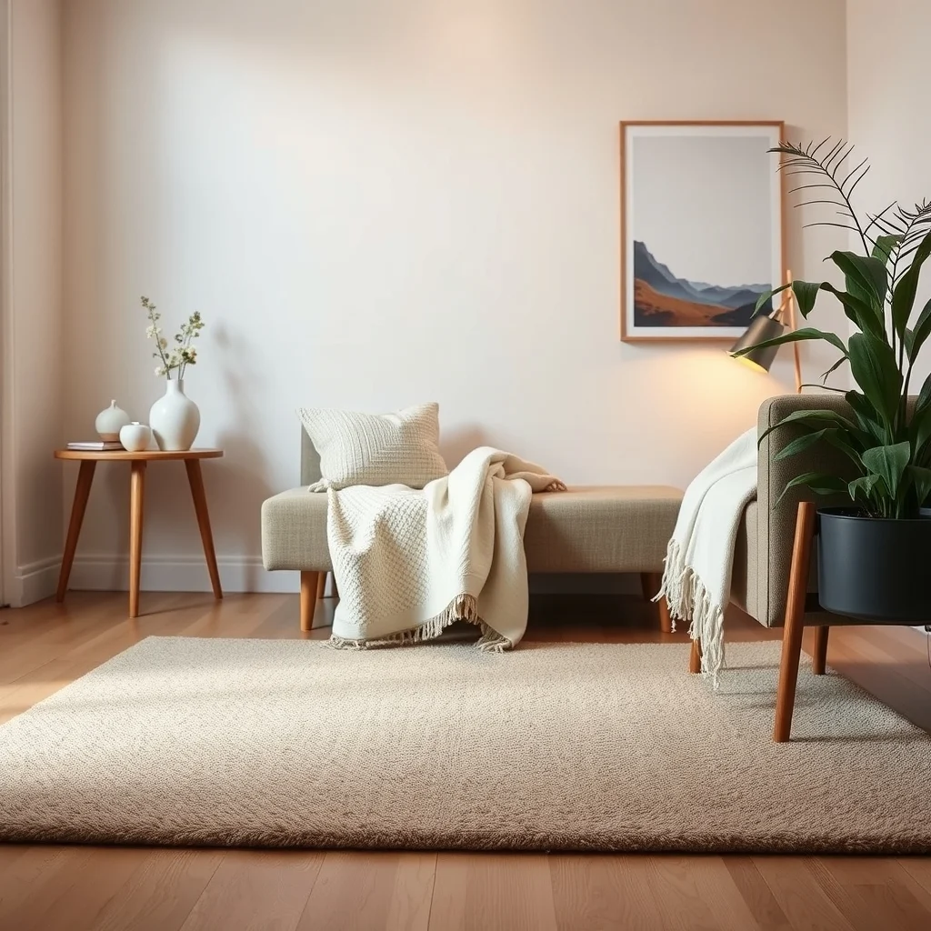
Textiles are the quickest way to introduce texture and warmth into a neutral scheme. A low‑pile wool rug in a warm taupe anchors the living room and adds a tactile layer that feels pleasant underfoot. Pair the rug with linen curtains in an ivory tone; the natural fibers filter light softly, creating a diffused glow that enhances the greige walls. Throw pillows in muted terracotta or sand‑colored boucle invite you to sink in, while a chunky knit throw draped over a sofa adds a handcrafted feel without clashing with the overall hue.
When mixing fabrics, consider the scale of patterns. A subtle herringbone on a slipcover can coexist with a larger, abstract geometric print on a cushion as long as both stay within the warm neutral family. This balance prevents visual chaos and maintains the designer look. Keep the maintenance in mind: natural fibers like linen and wool are durable but benefit from regular vacuuming and spot cleaning to preserve their softness.
3. Wood Tones that Complement
© 2026 AI Illustrator — Inspiration Only
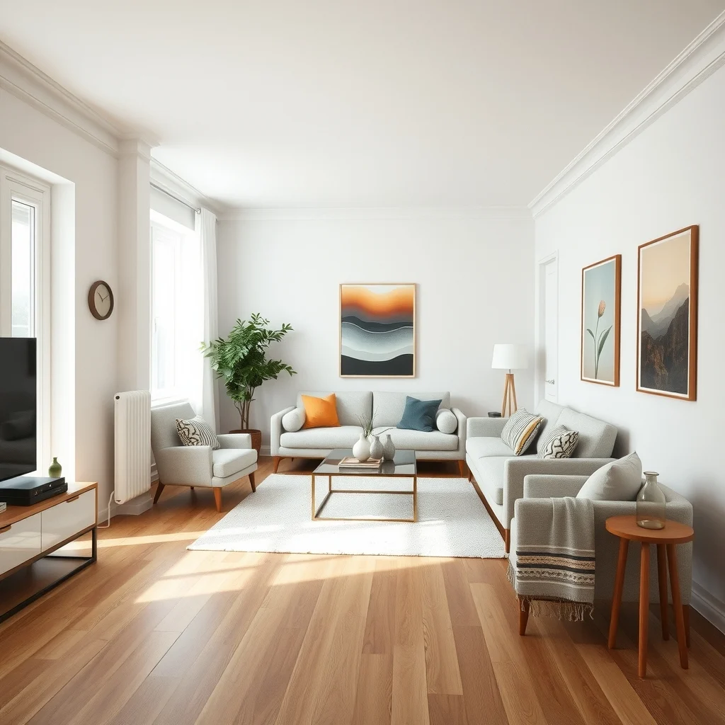
Wood brings an organic richness that deepens the warmth of a neutral palette. Mid‑tone oak flooring, with its gentle grain, reflects the soft light of a greige wall while providing a sturdy foundation for furniture arrangements. If you prefer a darker look, walnut cabinets or a coffee table in a rich, chocolate hue create a sophisticated contrast without drifting away from the overall warmth. The key is to choose wood finishes that have a warm undertone; a cool‑stained pine can feel out of place against a warm greige backdrop.
Furniture placement also influences how wood interacts with the room. A low‑profile sofa in a neutral linen fabric placed on a rug allows the floor’s wood grain to remain visible, extending the sense of space. When space is limited, consider floating shelves in a light maple finish; they provide storage while keeping the floor open, reinforcing the airy feel that warm neutrals aim to achieve.
4. Subtle Accent Hues for Visual Interest
© 2026 AI Illustrator — Inspiration Only
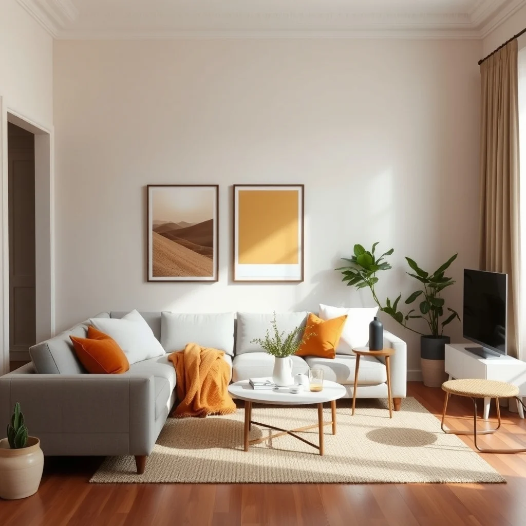
Even within a neutral framework, a hint of color prevents monotony. Soft terracotta, muted olive, or a gentle mustard can act as accents that echo the warmth of the base palette. Introducing these shades through decorative objects—such as a ceramic vase, a woven basket, or a set of matte‑finished metal trays—adds depth without demanding attention. Because the accents are muted, they blend seamlessly with the greige walls and wooden elements, creating a layered look that feels intentional.
It’s easy to overdo accent colors, so limit them to a few key pieces per room. A single terracotta lamp base beside a reading chair, for example, draws the eye without competing with the surrounding neutrals. If you’re unsure about the exact shade, start with a small item and observe how it interacts with the changing light throughout the day; this trial period ensures the hue remains harmonious from sunrise to sunset.
5. Lighting that Enhances Warmth
© 2026 AI Illustrator — Inspiration Only
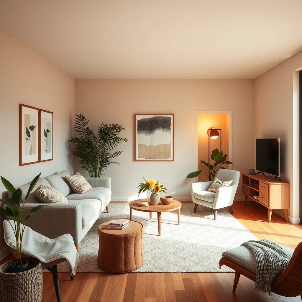
Lighting is the invisible brush that paints the final mood of a space. Warm‑temperature LEDs (around 2700‑3000 K) mimic the glow of incandescent bulbs, reinforcing the cozy atmosphere that warm neutrals aim for. Layered lighting—combining overhead fixtures, floor lamps, and table lamps—allows you to adjust the intensity based on activity. A brushed brass pendant over a dining table adds a subtle metallic sheen that reflects the greige walls, while a fabric‑draped floor lamp beside a sofa creates a soft pool of light for evening reading.
Consider the direction of light as well. Side lighting from a floor lamp highlights the grain of a wooden sideboard, emphasizing texture. Diffused light from a linen shade reduces harsh shadows, making the room feel more inviting. When selecting fixtures, choose designs that echo the natural materials already present—such as a wooden base or a ceramic shade—to keep the visual language cohesive.
6. Functional Storage that Stays Neutral
© 2026 AI Illustrator — Inspiration Only
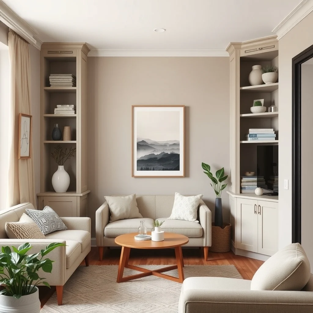
Clutter can quickly undermine a designer aesthetic, so integrating storage that blends with the warm neutral palette is essential. Built‑in cabinetry painted in the same greige as the walls creates a seamless look, while open shelving in a light oak finish offers a place for books and decorative objects without breaking the color flow. Woven baskets in natural fibers, such as seagrass or jute, provide hidden storage for blankets and magazines while adding a tactile element that complements the other textures in the room.
When space is at a premium, consider multifunctional pieces. An ottoman upholstered in a warm linen fabric can serve as both extra seating and a concealed compartment for remote controls or linens. The advantage of neutral storage is that it remains unobtrusive, allowing the room’s overall palette to stay the star. Just be mindful of the weight of items stored; heavy objects can cause wear on softer fabrics, so rotate heavier pieces to sturdier shelves when possible.
7. Personal Touches without Breaking the Palette
© 2026 AI Illustrator — Inspiration Only
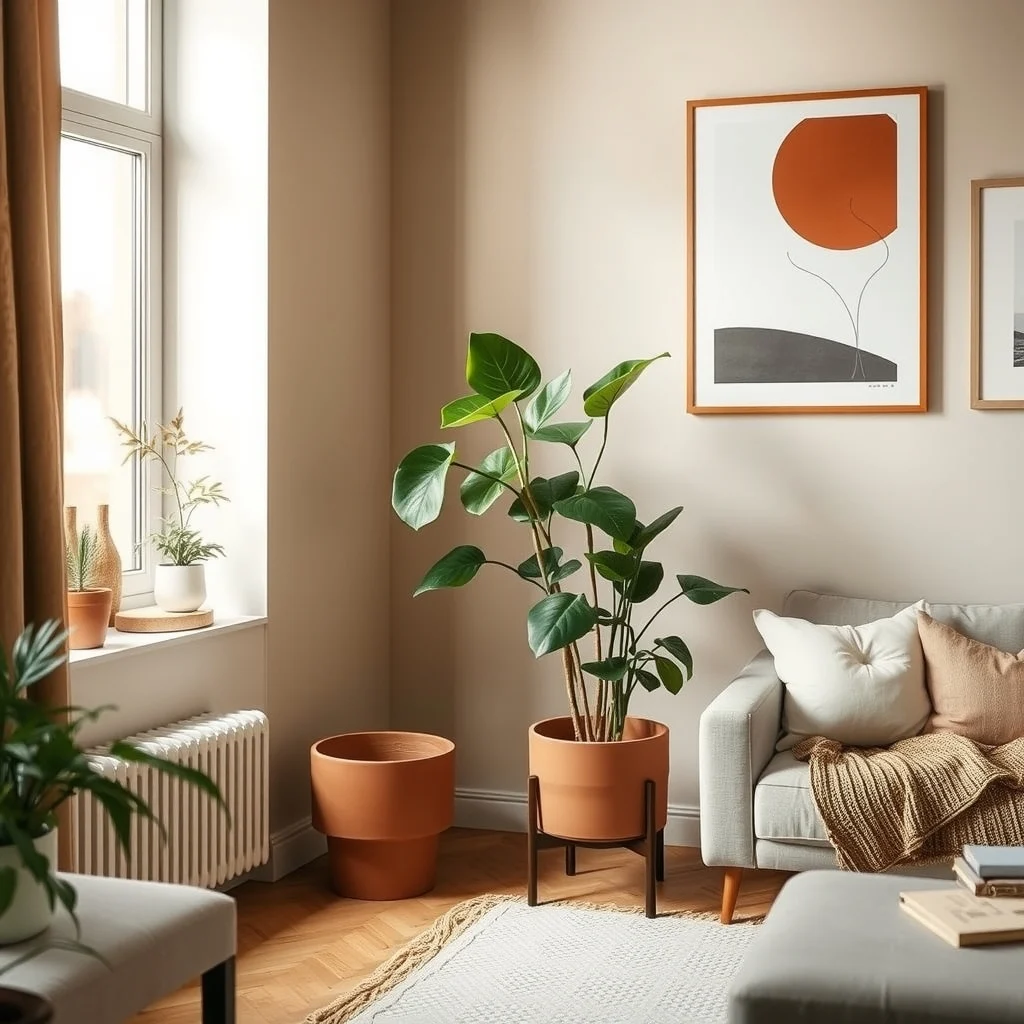
Personalization is what makes a designer look feel lived in. Plants, for instance, introduce a splash of green that feels organic and works well with warm neutrals. A tall fiddle‑leaf fig in a simple terracotta pot adds height and a natural element that softens the hard lines of furniture. Ceramic pieces in muted earth tones—such as a hand‑thrown bowl or a set of coasters—provide subtle personality while staying within the color family.
Artwork can also reinforce the palette without overwhelming it. A large canvas featuring abstract brushstrokes in soft ochre, beige, and ivory adds visual interest while echoing the room’s hues. When hanging art, aim for a scale that respects the room’s dimensions; a piece that is too large can dominate a modest apartment, while a series of smaller frames can create a balanced gallery wall. By choosing items that echo the warm neutral theme, you maintain cohesion while showcasing your individual taste.
FAQ
© 2026 AI Illustrator — Inspiration Only
How do I choose the right shade of greige for my living room?
Start by testing large swatches on multiple walls and observe them at different times of day; the side that receives morning light will look brighter, while evening light will reveal the undertone’s warmth.
Can I use dark wood flooring with a warm neutral palette?
Yes, dark wood such as walnut can add depth, but balance it with lighter furniture and textiles to prevent the room from feeling too heavy.
What type of lighting is best for enhancing warm neutrals?
Warm‑temperature LEDs (2700‑3000 K) paired with layered fixtures—overhead, floor, and table lamps—create a soft glow that complements the palette.
How can I add color without disrupting the neutral scheme?
Introduce muted accent hues like terracotta or olive through small accessories—vases, cushions, or a single piece of artwork—so the color feels like a subtle extension rather than a clash.
Is it okay to mix different wood tones in the same space?
Mixing wood tones works when they share a warm undertone; pairing a light oak coffee table with a walnut sideboard can create visual interest while staying cohesive.
Final Thoughts
© 2026 AI Illustrator — Inspiration Only
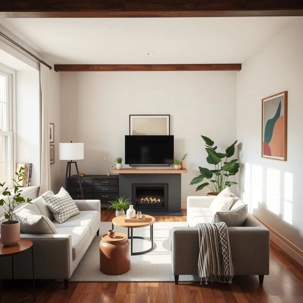
Warm neutral palettes offer a timeless foundation that can adapt to changing trends and personal tastes. By thoughtfully selecting wall colors, layering textures, balancing wood tones, sprinkling muted accents, curating lighting, integrating discreet storage, and adding personal touches, you can transform an ordinary apartment into a space that feels both designer and comfortably lived‑in. The beauty of this approach lies in its flexibility—each element can be adjusted to fit budget, size, and lifestyle, ensuring that the final result reflects both aesthetic ambition and everyday practicality.