
Living in a sun‑lit apartment gives you a natural canvas that can make even modest spaces feel refined. The challenge is choosing hues that cooperate with the daylight rather than compete with it. In this article you’ll find seven carefully considered color pairings, each explained with the way light interacts, the textures that complement them, and practical steps you can take to bring the look together without over‑complicating the process.
1. Soft Neutrals Paired with Muted Green
© 2026 AI Illustrator — Inspiration Only
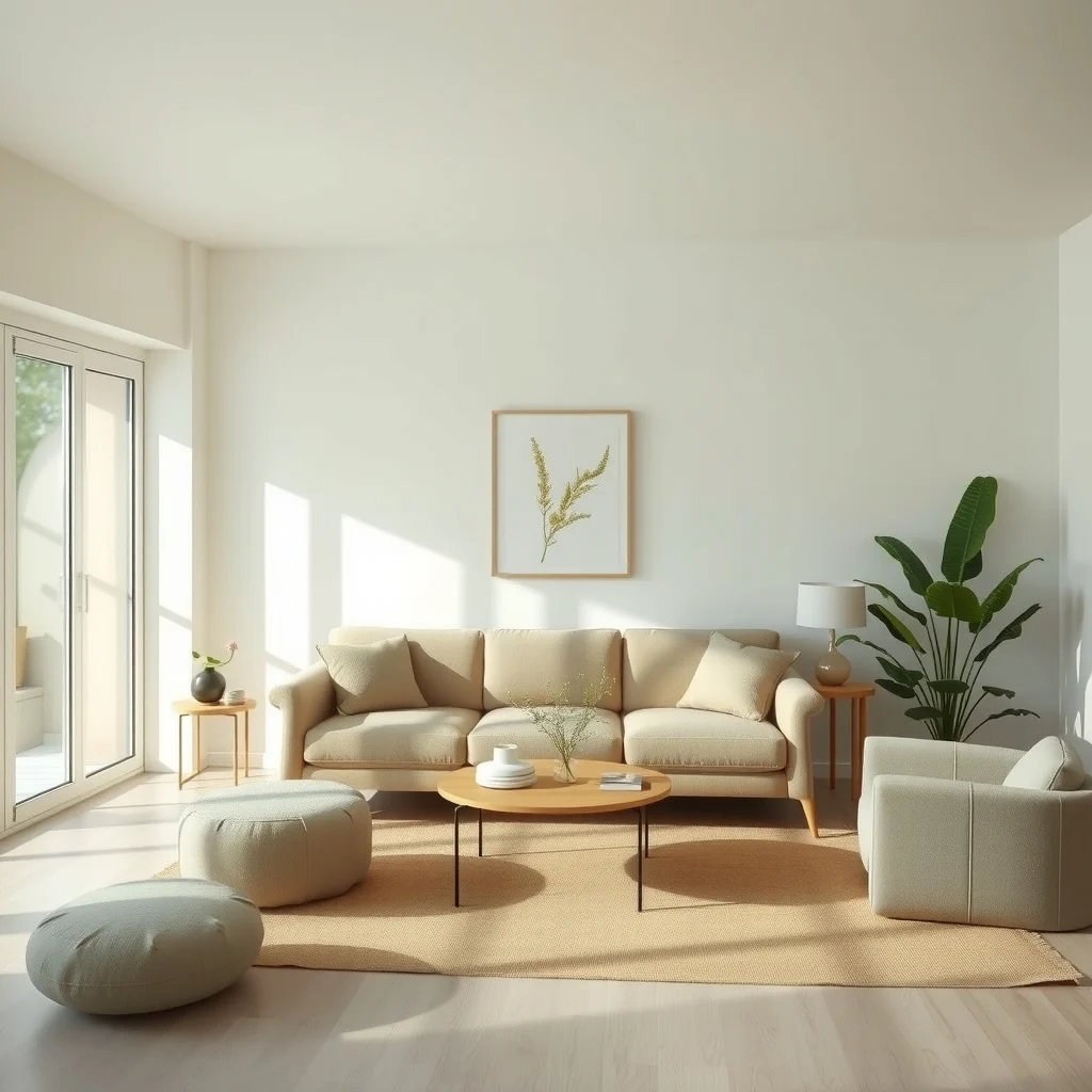
When the morning sun streams across a living room, a backdrop of warm ivory or light oat creates a gentle glow that never feels stark. Introducing a muted olive or sage on an accent wall adds just enough depth to keep the room from flattening out. The green works especially well behind a low‑profile sofa upholstered in linen, because the fabric’s natural texture catches the light and highlights the subtle undertones of the paint.
What’s Your Apartment Decor Style?
Answer these quick questions to discover your perfect decor vibe.
Why this works is simple: the neutral base reflects the daylight, while the muted green absorbs a fraction of it, creating a gentle contrast that feels organic rather than forced. To apply the scheme, paint the larger walls in the soft neutral and choose the green for a single wall that faces the primary window. If you prefer a more flexible approach, consider swapping the green onto a large piece of furniture—such as a credenza or a built‑in bookshelf—so the color can be moved if your tastes change.
A practical consideration is maintenance. Light‑reflecting neutrals tend to show dust more readily, so a washable satin finish is advisable. The green, being deeper, can hide minor scuffs, making it a forgiving choice for high‑traffic zones. When the season shifts and the daylight becomes harsher, a sheer linen curtain can soften the contrast without altering the paint.
2. Warm Greige with Deep Navy Accents
© 2026 AI Illustrator — Inspiration Only
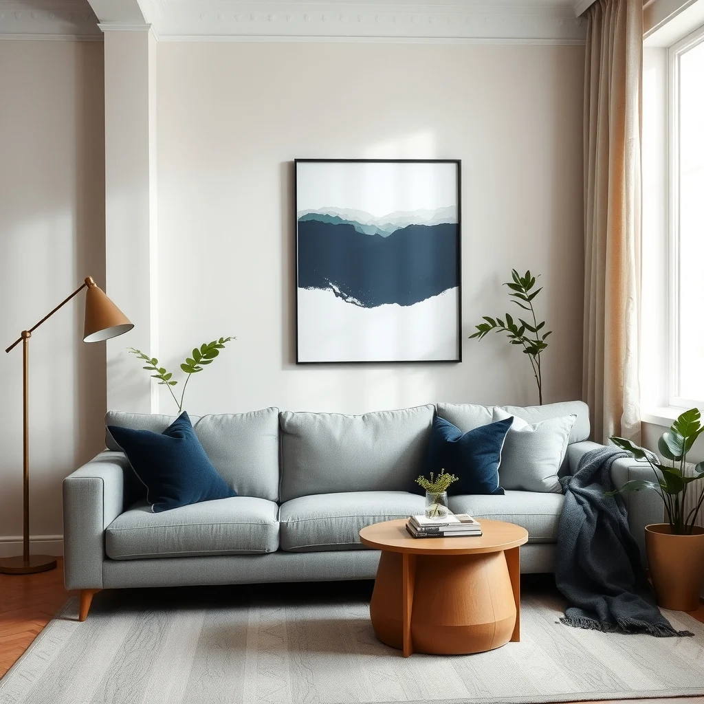
Greige—a blend of gray and beige—offers a sophisticated base that adapts to both cool and warm daylight. Adding deep navy on a secondary wall or through a series of large-scale artworks introduces a sense of gravity that anchors the space. The navy’s richness becomes especially apparent in the late afternoon, when the sun’s angle deepens the shadows.
Implementing this combination works best when the greige is used on the ceiling as well as the walls, creating a seamless sky‑like canopy that lifts the room. Navy can then be introduced through a plush velvet armchair or a set of navy‑dipped ceramic vases, allowing the color to appear in tactile forms without overwhelming the walls.
One trade‑off to keep in mind is that navy can make a small apartment feel tighter if overused. Reserve it for focal points—perhaps the wall behind a TV console or the back of a dining nook—so the visual weight is contained. Because greige reflects light, you’ll notice the room stays bright even on overcast days, reducing the need for additional lighting.
3. Creamy Whites Coupled with Charcoal Accents
© 2026 AI Illustrator — Inspiration Only
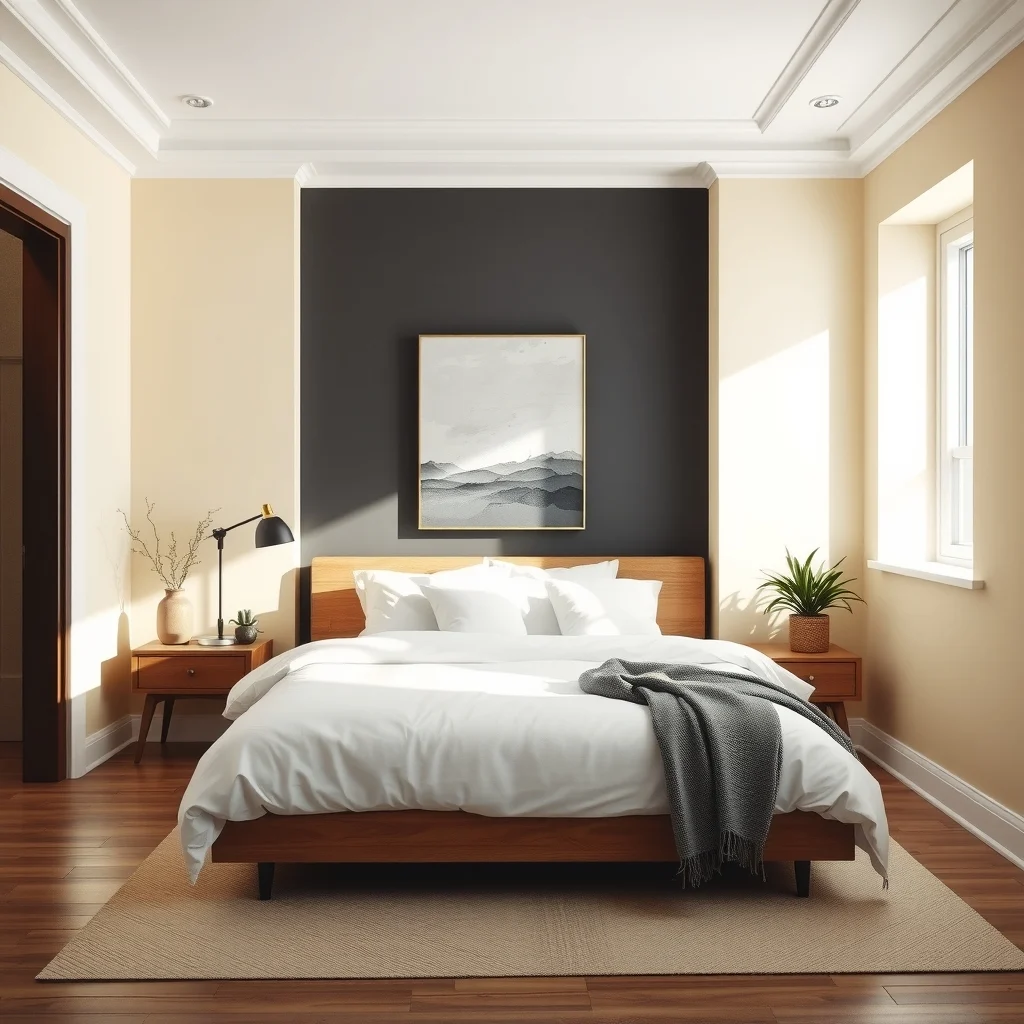
Pure white often feels clinical, but a creamy white with a hint of yellow undertone brings warmth that feels inviting in direct sunlight. Charcoal, applied sparingly, offers a modern counterpoint that reads as sophisticated rather than heavy. A charcoal floor rug or a set of slim metal legs on a coffee table can introduce the darker tone without demanding a full wall.
The reason this pairing succeeds is that the creamy white amplifies the daylight’s natural color temperature, while charcoal absorbs excess brightness, preventing glare. For a balanced look, paint the main walls in the creamy white and reserve charcoal for vertical elements—such as a bookshelf or a tall plant stand—so the eye naturally moves upward.
From a practical standpoint, creamy whites can yellow over time if exposed to strong sunlight. Selecting a low‑VOC, matte‑finish paint helps mitigate discoloration and keeps the surface easy to wipe down. Charcoal surfaces, especially those in matte finishes, hide fingerprints well, which is helpful in high‑use areas like entryways.
4. Dusty Rose Meets Sage Green
© 2026 AI Illustrator — Inspiration Only
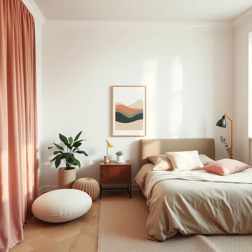
A gentle dusty rose on the walls creates a soft, romantic atmosphere that never feels saccharine when paired with the earthy restraint of sage green. The combination works beautifully in a bedroom or a quiet reading corner where natural light filters through light curtains, allowing the colors to shift subtly throughout the day.
To bring this duo to life, consider painting the upper third of the wall in rose and the lower two‑thirds in sage, a technique that mimics the natural gradient of sunrise. Upholstery in a linen blend—perhaps a bench seat or a set of poufs—can echo the rose, while a sage‑tinted throw pillow adds a layer of comfort without competing with the wall colors.
The main limitation of this palette is its tendency to feel muted in spaces lacking sufficient daylight. If your apartment receives limited sun, supplement the scheme with warm metallic accents such as brushed brass lamp bases, which reflect whatever light is available and keep the room from feeling flat.
5. Slate Blue with Warm Wood Tones
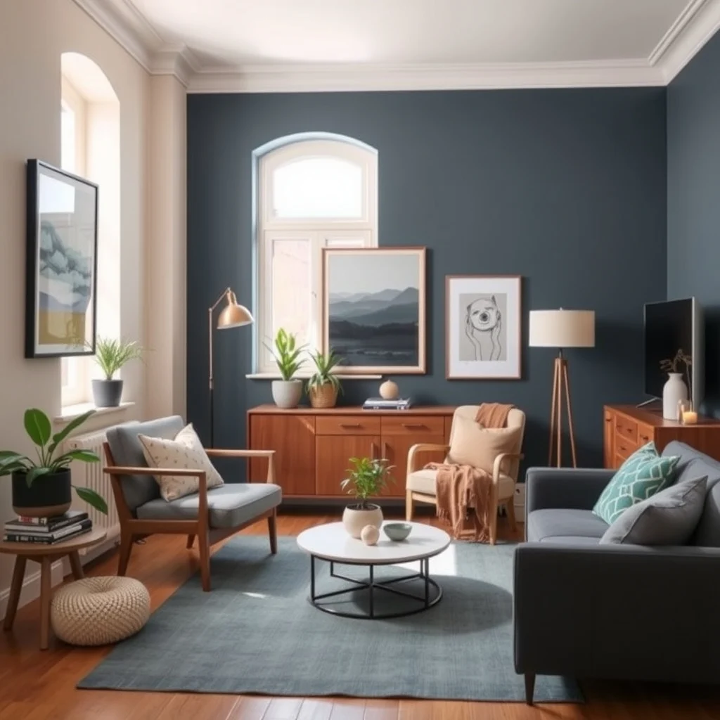
© 2026 AI Illustrator — Inspiration Only
Slate blue carries a cool, slightly moody vibe that deepens as the sun moves across the sky. Pairing it with warm wood—think honey‑colored oak flooring or a walnut sideboard—creates a balanced contrast that feels both grounded and airy. The wood’s natural grain catches the light, adding texture that prevents the blue from appearing too austere.
In practice, paint the largest wall facing the main window in slate blue, allowing the daylight to bring out its subtle gray undertones. Complement the blue with a mid‑century coffee table in warm wood, and choose a rug in a neutral jute that ties the two materials together. The result is a space that feels cohesive from sunrise to sunset.
A potential drawback is that slate blue can make a room feel cooler in winter months. To counteract this, incorporate plush textiles—such as a thick wool throw or a sheepskin rug—in earthy tones, providing both visual warmth and physical comfort when the temperature drops.
6. Pale Terracotta with Muted Teal
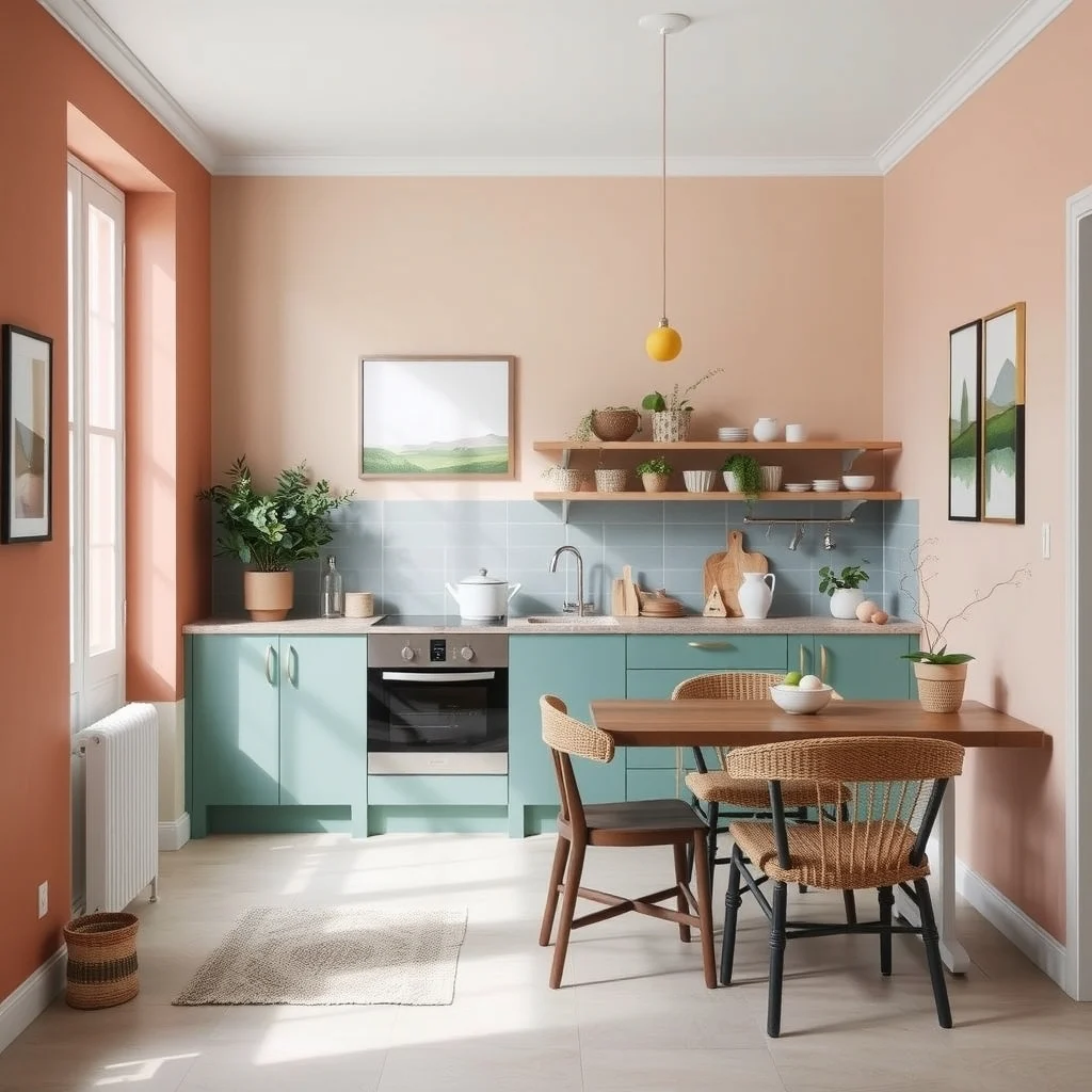
© 2026 AI Illustrator — Inspiration Only
Pale terracotta, reminiscent of sun‑baked clay, offers a subtle warmth that thrives under natural light. When matched with a muted teal—perhaps on a kitchen backsplash or a set of open shelving—the combination evokes a Mediterranean feel without feeling overly themed. The teal adds a cool counterbalance that keeps the palette from becoming too warm.
To execute the look, paint the kitchen walls in the pale terracotta and use teal tiles or glass panels for the backsplash. In the living area, a terracotta‑hued sofa paired with teal‑colored cushions creates continuity across rooms. The natural light bouncing off the terracotta will highlight its earthy richness, while the teal glints subtly, adding depth.
One consideration is that both colors can show wear over time, especially on high‑traffic surfaces. Selecting a semi‑gloss finish for the backsplash makes cleaning easier, while opting for a durable, stain‑resistant fabric on the sofa ensures the terracotta remains vibrant. If you find the teal too dominant, replace a few accessories with neutral ceramics to dial back the intensity.
7. Black and Ivory in a Light‑Dominated Space
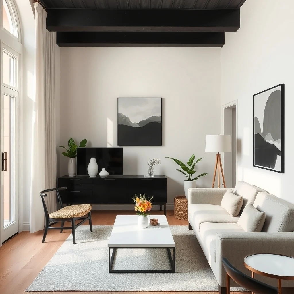
© 2026 AI Illustrator — Inspiration Only
Black and ivory might seem like a high‑contrast duo reserved for dramatic interiors, yet when natural light floods the room, the contrast becomes elegant rather than stark. Ivory walls reflect daylight, keeping the space bright, while black accents—such as a sleek metal frame couch or a set of black‑finished cabinets—add definition.
The key to success lies in limiting the black to architectural elements and larger furniture pieces, allowing the ivory to dominate the visual field. A black‑brushed stainless steel kitchen island, for example, becomes a focal point without overwhelming the surrounding ivory cabinets. In the living room, a black coffee table paired with ivory slipcovers creates a timeless balance.
A practical trade‑off is that black surfaces can show dust more readily than lighter tones. Regular dusting with a microfiber cloth and choosing a matte black finish can reduce the need for constant polishing. Because the ivory reflects light, you’ll rarely need supplemental lighting during the day, but adding a warm‑toned floor lamp for evenings can preserve the sophisticated mood after sunset.
FAQ
© 2026 AI Illustrator — Inspiration Only
What paint finish works best for rooms with a lot of natural light?
A low‑sheen satin or eggshell finish balances durability with a soft sheen that reflects daylight without creating glare.
Can I use bold colors in a small apartment without making it feel cramped?
Yes, if you confine bold hues to accent walls, furniture, or accessories while keeping the majority of the space in lighter tones, the room retains openness.
How should I coordinate new wall colors with existing furniture?
Identify the dominant undertone in your furniture—whether it’s warm wood, cool metal, or neutral fabric—and choose wall colors that either complement or provide a subtle contrast, ensuring the overall palette feels cohesive.
Is it advisable to change wall colors seasonally?
Seasonal changes are possible, but using washable paint and selecting hues that work year‑round—such as a soft greige or a muted teal—reduces the need for frequent repainting.
What lighting should I add for evenings if my apartment relies on natural light?
Layered lighting—overhead dimmable fixtures combined with table or floor lamps placed near seating—creates a warm ambience without overwhelming the natural‑light‑derived color palette.
Final Thoughts
© 2026 AI Illustrator — Inspiration Only
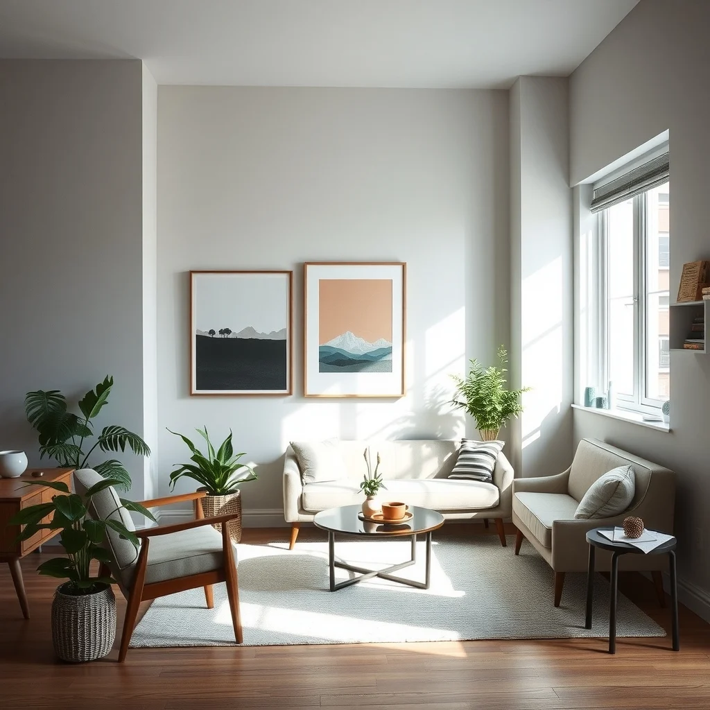
Choosing color combinations that respond to natural light is less about following trends and more about understanding how daylight interacts with pigment, texture, and material. By selecting pairs that balance reflection and absorption—whether it’s soft neutrals with muted greens or the bold contrast of black and ivory—you can craft an apartment that feels sophisticated from sunrise to sunset. Remember to consider maintenance, scale, and the specific character of your space, and you’ll enjoy a harmonious home that looks polished without the need for constant re‑decoration.