
Living in a compact apartment often means every square foot is shared between several functions. When the living room, bedroom, and kitchen each wear a completely different palette, the space can feel disjointed and cramped. A thoughtful color strategy can turn that collection of rooms into a cohesive backdrop, making movement between them feel natural and the overall footprint appear larger. Below are seven approaches that help you choose and apply colors so each area retains its personality while still belonging to a unified whole.
1. Begin with a unifying base hue
© 2026 AI Illustrator — Inspiration Only
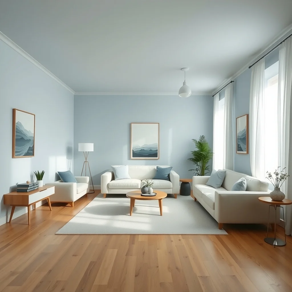
Choosing a single, muted shade to cover walls, ceilings, or large pieces of furniture creates an invisible thread that runs through the apartment. A warm greige, soft dove‑blue, or pale sage works well because it can accommodate both bright accents and darker furnishings without clashing. When the base color is applied consistently, it reduces visual noise and lets the eye rest, which is especially valuable in a small layout where the eye tends to jump from one detail to another. To keep the scheme from feeling monotonous, vary the finish—matte in the bedroom for a calming retreat, satin in the kitchen where a bit of sheen helps hide moisture spots. The result is a backdrop that feels intentional yet flexible enough for each room’s unique needs.
What’s Your Apartment Decor Style?
Answer these quick questions to discover your perfect decor vibe.
2. Introduce a shared accent tone
© 2026 AI Illustrator — Inspiration Only
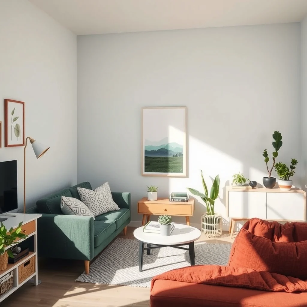
While the base hue provides continuity, a single accent color woven through textiles, artwork, or small décor items adds interest without breaking the flow. For example, a muted terracotta can appear as a throw pillow in the living area, a ceramic vase on the kitchen counter, and a bedside lamp shade in the bedroom. Because the accent appears in different textures, it feels fresh each time while still reminding you of the larger palette. Selecting an accent that complements the base hue—rather than competes with it—prevents visual overload. If the base is cool, choose a warm accent; if the base is warm, a cool accent can provide a gentle contrast that energizes the space.
3. Play with tonal variation across spaces
© 2026 AI Illustrator — Inspiration Only
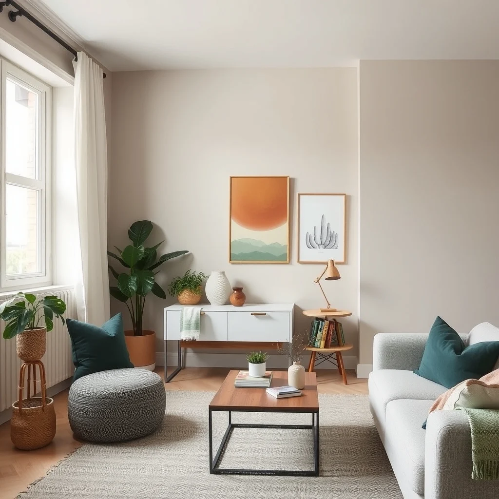
Even when the same color family is used throughout, adjusting its lightness or saturation from room to room creates a subtle progression that guides the eye. A lighter wash of the base color in the entryway welcomes you, while a slightly deeper version in the living room adds a sense of intimacy. In the bedroom, a softened tone can promote relaxation, and in the kitchen a brighter shade can enhance the perception of cleanliness. This gradient approach respects the limited square footage by preventing any single area from feeling overly dominant, and it encourages a natural visual journey as you move from one space to the next.
4. Use consistent material palettes to reinforce color
© 2026 AI Illustrator — Inspiration Only
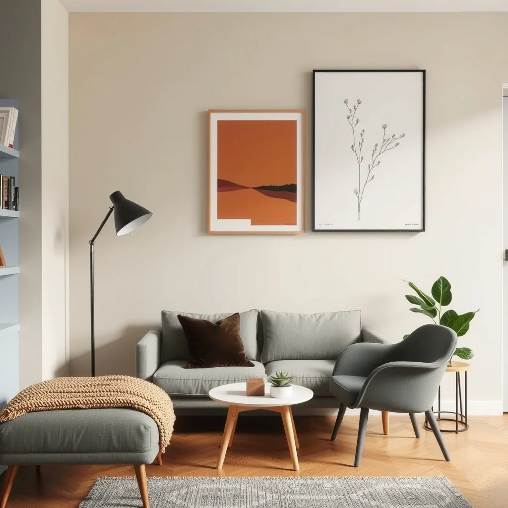
Materials such as wood, metal, and textile weave the color story together in ways paint alone cannot. Selecting oak flooring throughout the apartment, for instance, grounds the space and reflects the base hue, while brushed brass hardware adds a gleam that echoes the shared accent tone. When a wooden dining table appears in the kitchen, a matching nightstand in the bedroom subtly links those rooms. Even soft furnishings—linen curtains in the living room and a cotton duvet cover in the bedroom—can share the same weave or finish, reinforcing the color connection through texture. Consistency in material choices also simplifies maintenance, as you become familiar with cleaning methods for each surface.
5. Leverage lighting to tie hues together
© 2026 AI Illustrator — Inspiration Only
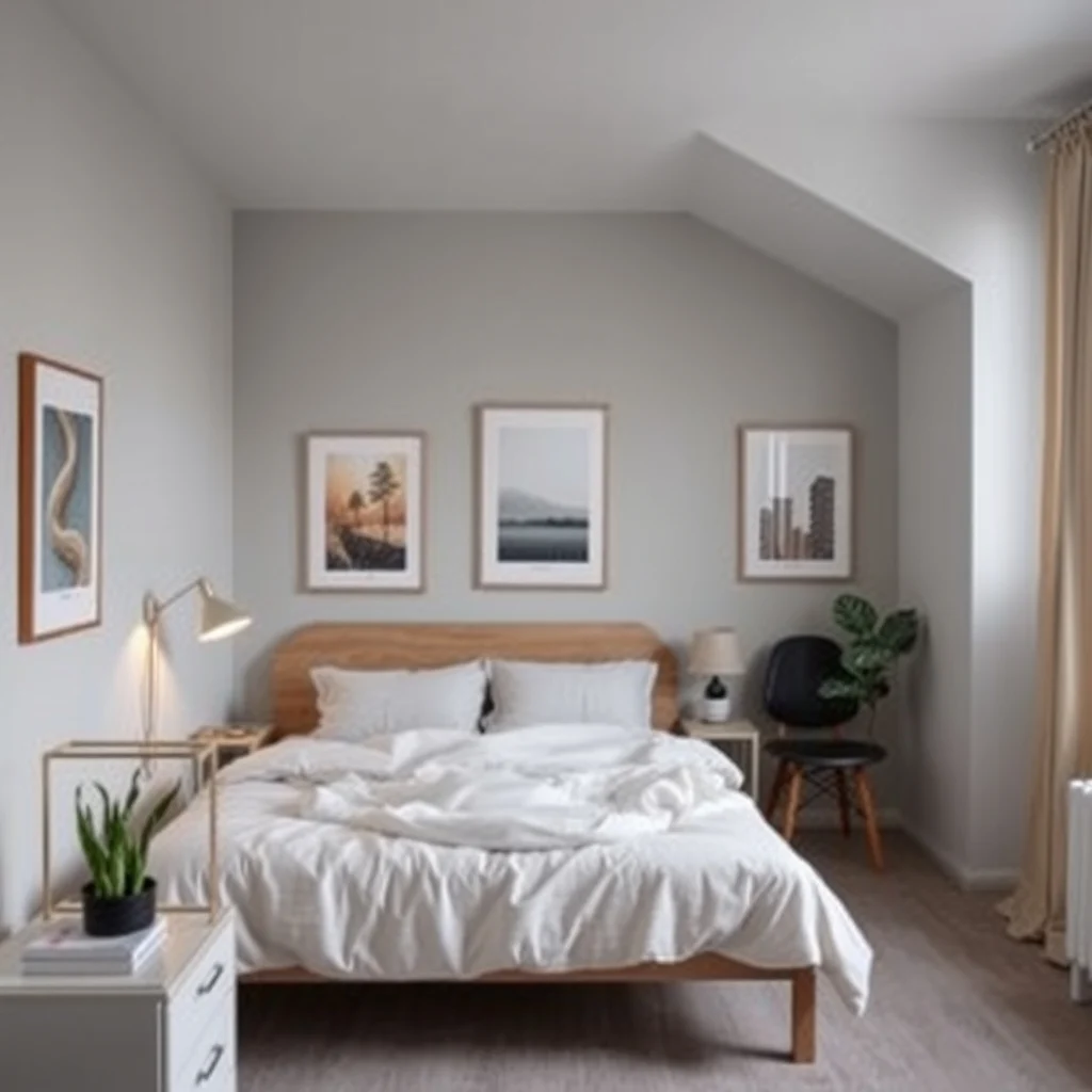
Light is the invisible brush that alters how colors are perceived, and thoughtful illumination can harmonize disparate rooms. Warm LED bulbs placed near the base color in the bedroom will render it as a soothing, muted tone, while cooler daylight‑simulating fixtures in the kitchen keep the same shade looking fresh and clean. Layered lighting—overhead, task, and accent—allows you to emphasize the shared accent color at different times of day. A pendant lamp with a terracotta shade in the dining nook will echo the accent found on a sofa cushion, creating a visual echo that feels intentional. Adjusting the intensity of each fixture also helps balance the overall palette, preventing any single area from feeling too bright or too dim.
6. Create visual flow with transitional zones
© 2026 AI Illustrator — Inspiration Only
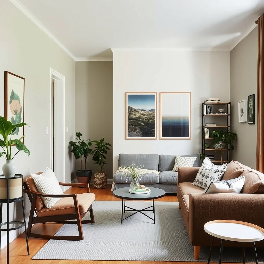
Hallways, open‑plan corners, and even built‑in shelving act as bridges between rooms, and they are ideal spots to reinforce the color scheme. Painting the hallway a shade that sits midway between the living room’s deeper tone and the bedroom’s lighter hue creates a gentle gradient that the eye follows naturally. Similarly, a narrow console table painted in the base color can host decorative items in the shared accent tone, acting as a visual cue that the spaces are related. When open‑plan layouts are present, a rug that incorporates both the base and accent colors can anchor the living area while extending into the kitchen, subtly uniting the two zones without the need for additional walls.
7. Plan for seasonal swaps without breaking the link
© 2026 AI Illustrator — Inspiration Only
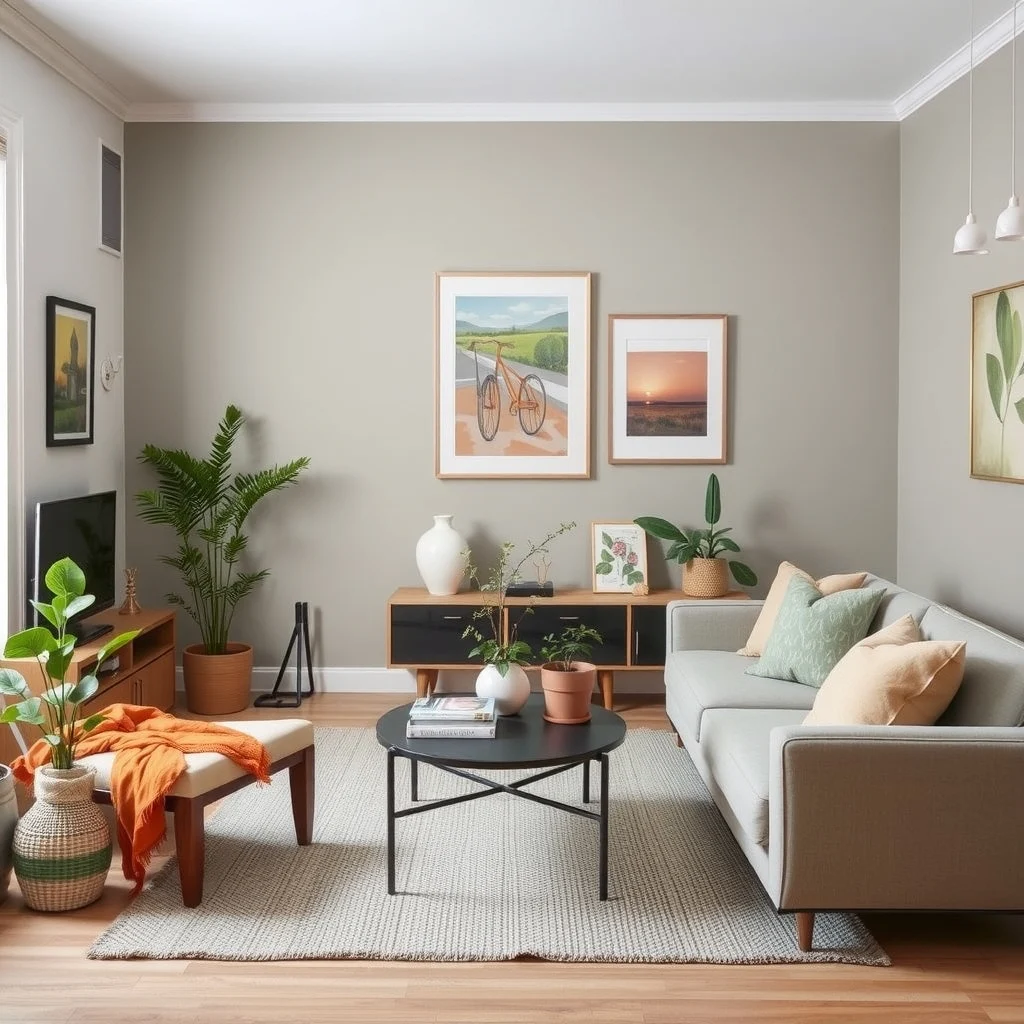
One advantage of a cohesive color scheme is that you can refresh the look with seasonal accessories while keeping the underlying connection intact. During spring, swap a terracotta throw for a pastel‑green one; in autumn, replace it with a deep mustard pillow. Because the base hue remains unchanged, these changes feel like a natural evolution rather than a jarring overhaul. The key is to keep the accent items within the same color family, ensuring that even new textures or patterns still reference the original palette. This approach lets you enjoy variety throughout the year without the expense or effort of repainting.
FAQ
© 2026 AI Illustrator — Inspiration Only
How do I choose a base color that works in both a sunny kitchen and a dim bedroom?
Pick a neutral shade with a balanced undertone, such as greige or soft slate, which adapts well to varying light levels. In bright areas the color will appear lighter, while in low‑light spaces it will feel cozier, maintaining harmony across the apartment.
Can I use the same accent color in a bathroom without it looking too repetitive?
Yes, by applying the accent in smaller doses—like a towel set, a soap dispenser, or a patterned shower curtain—you keep the reference subtle. The bathroom’s tile and fixtures provide enough visual contrast to prevent the accent from feeling overused.
What if my apartment has uneven natural light from one side to the other?
Use the side with more daylight for rooms that benefit from brighter tones, such as the kitchen, and place deeper or cooler shades on the shadier side, like the bedroom. This placement respects the natural light distribution while preserving the overall palette.
Is it okay to mix matte and glossy finishes within the same color family?
Mixing finishes adds depth and prevents a flat appearance. A matte wall paired with a glossy countertop or a satin‑finished cabinet can highlight different surfaces without disrupting the color continuity.
How often should I update accessories to keep the color scheme feeling fresh?
Changing textiles or decorative pieces seasonally—every three to four months—offers a noticeable refresh without a major overhaul. Because the underlying colors stay the same, each update feels like a natural extension of the existing design.
Final Thoughts
© 2026 AI Illustrator — Inspiration Only
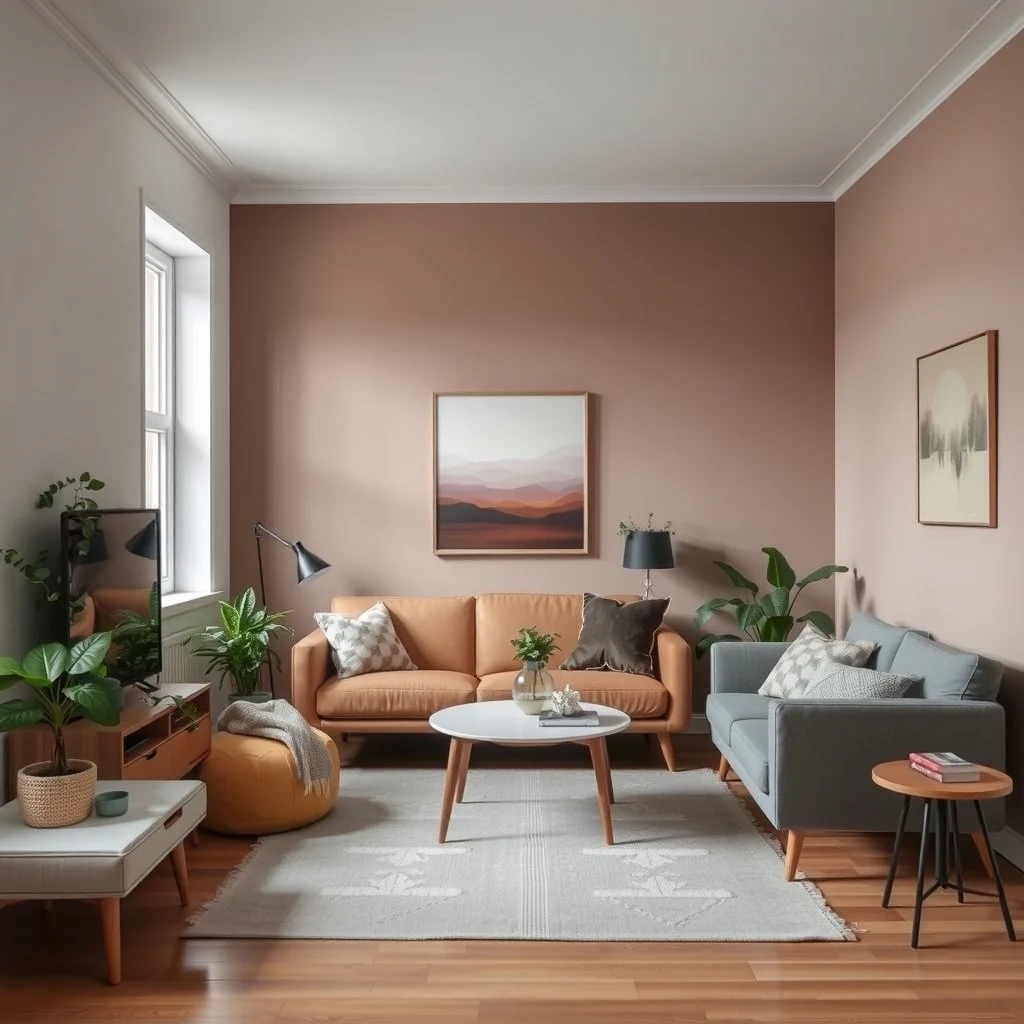
In a small apartment, color becomes a powerful tool for shaping perception and fostering unity. By establishing a consistent base hue, weaving in a shared accent, adjusting tones, aligning materials, and using light thoughtfully, you create a backdrop that feels both cohesive and adaptable. Transitional zones act as bridges, while seasonal accessories allow for fresh expressions without breaking the visual link. With these strategies, each room retains its character yet contributes to a harmonious whole, making your compact home feel larger, more organized, and genuinely yours.