
Living in a compact city apartment often feels like a constant negotiation between the bustle outside and the need for a calm interior. One of the simplest ways to tip the balance toward serenity is to let the walls, textiles, and accessories echo the hues you might find on a forest walk or a sun‑warmed hillside. Below are seven thoughtfully paired color schemes that bring the outdoors in without overwhelming a small space. Each palette is accompanied by practical suggestions for furniture, lighting, and finishes, so you can see how the colors will behave in real‑world rooms and decide which feels right for your lifestyle.
1. Warm stone and muted sage
© 2026 AI Illustrator — Inspiration Only
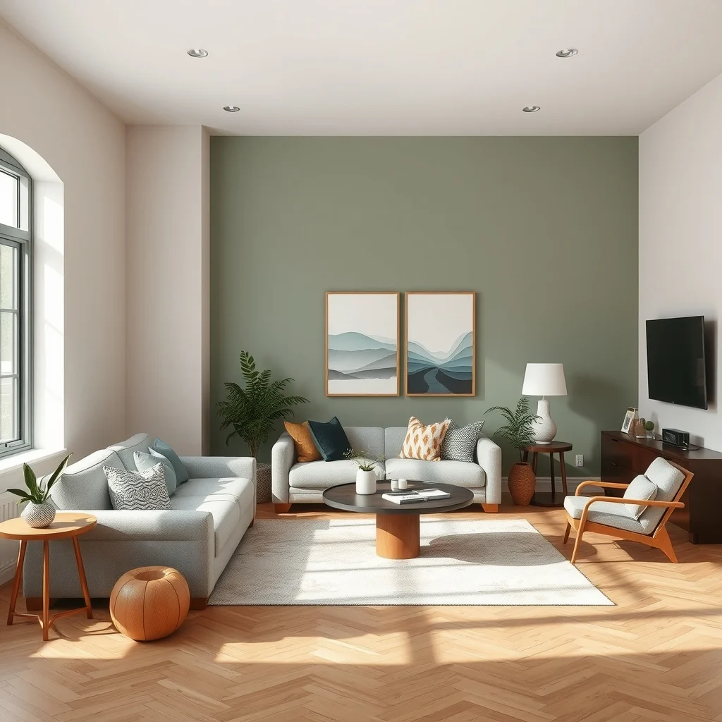
Imagine a living room where the main walls are coated in a warm stone gray, the kind of tone that resembles river‑rock after a light rain. Against that neutral backdrop, a muted sage green appears on a single accent wall or on a pair of built‑in shelves, offering a subtle nod to foliage without demanding attention. The combination works because the gray grounds the space while the sage injects a whisper of nature, creating a backdrop that feels both sophisticated and soothing. To reinforce the palette, choose a linen sofa in a soft ivory, a reclaimed‑oak coffee table, and woven jute rugs that add texture without competing with the colors. Brass floor lamps with a brushed finish provide warm illumination that highlights the stone’s undertones during the evening, and a few potted ferns placed on the sage wall bring the look full circle. If you have limited wall space, a sage throw pillow or a set of sage‑green ceramic vases can deliver the same effect without a full paint job.
What’s Your Apartment Decor Style?
Answer these quick questions to discover your perfect decor vibe.
2. Terracotta paired with soft sand
© 2026 AI Illustrator — Inspiration Only
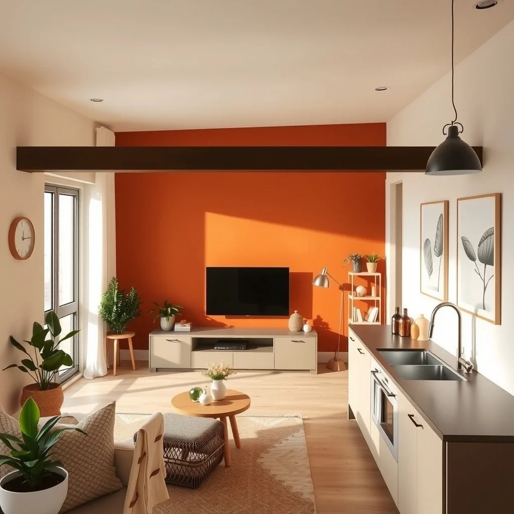
A deep terracotta, reminiscent of sun‑baked adobe, makes a striking statement when paired with a soft sand beige. The terracotta can be introduced through a feature wall behind the TV or as a painted kitchen island, while the sand hue blankets the remaining walls, keeping the room airy. The warmth of terracotta energizes the space, yet the sand neutralizes any potential intensity, resulting in a balanced, inviting atmosphere. Pair the colors with natural wood flooring left in a light finish, and choose a low‑profile sofa upholstered in a breathable linen blend that mirrors the sand tone. Textured clay pots, woven baskets, and a hand‑woven rug in muted earth tones reinforce the theme without adding visual clutter. For lighting, consider pendant fixtures with matte copper shades that echo terracotta’s reddish undertone, and be sure to use dimmers so the glow can be softened for evenings. If terracotta feels too bold for a bedroom, a terracotta‑colored throw blanket or a set of sand‑colored curtains can still convey the palette’s relaxed vibe.
3. Deep olive and buttery oat
© 2026 AI Illustrator — Inspiration Only
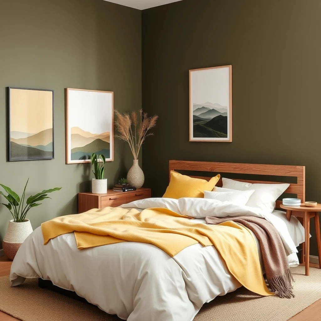
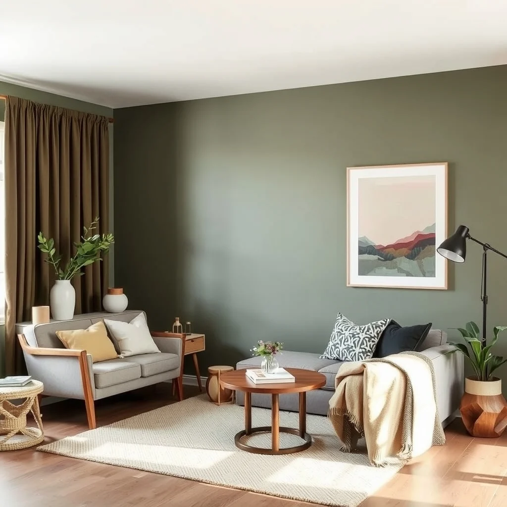
Deep olive offers a grounding, almost forest‑like presence that works beautifully as a primary wall color in a study or bedroom. Complement it with a buttery oat—a creamy, light yellow that feels like late‑summer wheat—on the ceiling, trim, or secondary walls. The contrast between the rich green and the gentle oat creates a sense of depth while preserving a light, breathable feel. Furniture in natural walnut or teak adds a warm wooden accent that harmonizes with both hues. A velvet armchair upholstered in a muted olive tone becomes a focal point without overwhelming the room, while oat‑colored linen drapes filter daylight softly. Metallic accents in aged brass or oil‑rubbed bronze enhance the earthy feel and add a hint of sophistication. When selecting artwork, choose pieces that incorporate both olive and oat tones, perhaps a landscape print with muted foliage. In smaller apartments, a single olive accent wall paired with oat accessories—such as cushions or a rug—delivers the same balanced effect without extensive painting.
4. Soft mushroom and muted teal
© 2026 AI Illustrator — Inspiration Only
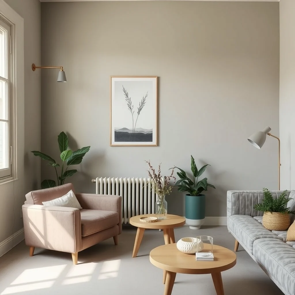
Soft mushroom gray, with its faint brown undertones, serves as an excellent neutral base that feels more organic than a stark white. When a muted teal is introduced on a side wall, a window frame, or a set of floating shelves, the space gains a cool, calming contrast reminiscent of misty mornings by a lake. The muted teal’s subtle blue‑green quality prevents the palette from feeling cold, while the mushroom gray maintains a warm, grounded atmosphere. To support the colors, incorporate a mid‑century walnut sideboard and a plush area rug in natural fibers that blend both shades. Lighting fixtures with frosted glass or matte black metal keep the look contemporary without detracting from the softness of the palette. If the apartment receives abundant natural light, the teal will appear brighter during the day and settle into a deeper hue as dusk approaches, adding visual interest without extra effort. For a bedroom, consider teal bedding with mushroom‑gray nightstands to keep the palette cohesive yet varied.
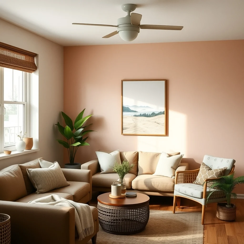
5. Dusty rose and weathered wood
© 2026 AI Illustrator — Inspiration Only
Dusty rose, a muted pink with earthy undertones, brings a gentle warmth that works well in spaces where you want a hint of color without the drama of brighter reds. Pair it with weathered wood—think reclaimed barn boards or drift‑finished pine—to anchor the softness in a tactile, natural element. A dusty‑rose accent wall behind a reading nook instantly creates a cozy enclave, while the weathered wood side table and shelving add visual weight and durability. Soft, natural‑woven cushions in ivory or muted taupe balance the palette, preventing the rose from feeling overly feminine. A floor lamp with a linen shade diffuses light, enhancing the rose’s blush without harsh glare. If the apartment’s layout limits wall coverage, a dusty‑rose area rug or a set of rose‑tinted ceramic dishes can introduce the hue subtly, while the weathered wood can appear in a headboard or a coffee table.
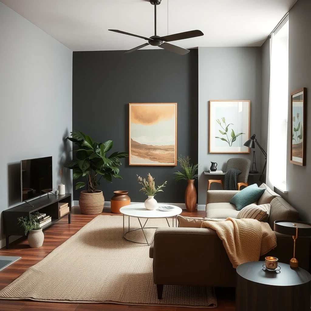
6. Charcoal and warm camel
© 2026 AI Illustrator — Inspiration Only
Charcoal provides a sophisticated, almost architectural backdrop that works especially well in loft‑style apartments with high ceilings. When you introduce warm camel—a soft, sandy brown—through a sofa, curtains, or a large area rug, the starkness of the dark walls softens, creating a balanced, inviting environment. The contrast is effective because charcoal absorbs light, making the camel tones appear richer, while the camel adds a layer of warmth that prevents the room from feeling cavernous. Pair the colors with a concrete coffee table or metal shelving to maintain an urban edge, and add greenery—such as a tall fiddle‑leaf fig—in a simple terracotta pot for a natural touch. Lighting should include a combination of recessed downlights and a statement floor lamp with a matte bronze finish, ensuring the charcoal does not become too oppressive after sunset. For studios, a camel‑colored pouf or ottoman can serve as both seating and a visual break from the dark walls.
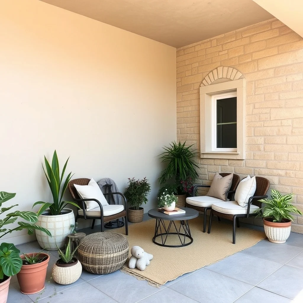
7. Layered neutrals with natural texture
© 2026 AI Illustrator — Inspiration Only
Sometimes the most relaxed look emerges from a carefully curated blend of neutrals—greige, taupe, and soft ivory—combined with tactile materials that echo the outdoors. Paint the largest walls in a greige that mirrors weathered stone, then use taupe on the ceiling to lift the room’s height subtly. Introduce ivory through linen curtains, a woven rug, or a plush throw, allowing light to bounce gently across surfaces. The true star of this palette is texture: a jute rug, a rattan lounge chair, and a reclaimed‑wood sideboard each bring depth without adding new colors. Because the hues are close in value, the room feels spacious and cohesive, while the varied materials prevent monotony. To avoid the space feeling too flat, incorporate a few accent pieces—perhaps a copper tray or a set of glass vases—that reflect light and add a whisper of shine. This approach works well in open‑plan apartments where the palette can flow from the living area into the kitchen, creating a seamless, natural feel throughout.
FAQ
© 2026 AI Illustrator — Inspiration Only
How can I test an earthy paint color before committing?
Start by painting a 12‑inch square on the wall where the color will be most visible. Observe the square at different times of day to see how natural and artificial light affect the hue. If the sample feels right after a full day’s exposure, it’s likely a safe choice for the entire room.
Can I use these palettes in a studio apartment without making the space feel cramped?
Yes, by keeping the dominant color light and reserving deeper tones for accents only. Light walls maintain an open feel, while a single accent wall or colored furniture adds personality without overwhelming the floor plan.
What flooring works best with earthy color schemes?
Natural wood in a medium or light finish complements most earthy palettes, as it echoes the same organic tones. If wood isn’t an option, large‑format porcelain tiles in stone‑like shades provide a similar grounding effect.
How do I keep earthy fabrics looking fresh over time?
Choose materials such as linen, cotton, or wool that breathe and can be machine‑washed or dry‑cleaned according to the care label. Spot‑clean stains promptly and rotate cushions regularly to distribute wear evenly.
Is it okay to mix multiple earthy palettes in one apartment?
Mixing works when the colors share a common undertone, like warm neutrals or muted greens. Use a unifying element—such as a consistent wood finish or similar textile texture—to tie the different palettes together and avoid visual clash.
Final Thoughts
© 2026 AI Illustrator — Inspiration Only
Earthy color palettes invite the calm of nature into the urban rhythm of apartment living. By pairing a grounding hue with a softer complement, and reinforcing the scheme with natural materials, thoughtful lighting, and textured accessories, you can create a home that feels both relaxed and intentionally styled. Whether you favor the deep drama of charcoal and camel or the subtle harmony of soft mushroom and teal, the key is to let the colors breathe and to balance them with tactile elements that remind you of the outdoors. With these seven palettes as a starting point, you have a flexible toolbox for shaping a space that feels as comforting as a walk through a forest, no matter how small the square footage.