
Living in a small apartment often means working with a limited budget, and that budget sometimes includes furniture that isn’t exactly showroom quality. The good news is that color can act as a sophisticated filter, elevating even the most modest pieces. By pairing the right hues on walls, textiles, and accessories, you can create a sense of depth, cohesion, and polish that makes inexpensive items feel intentional. Below are seven carefully considered color pairings, each explained with practical steps you can apply right away.
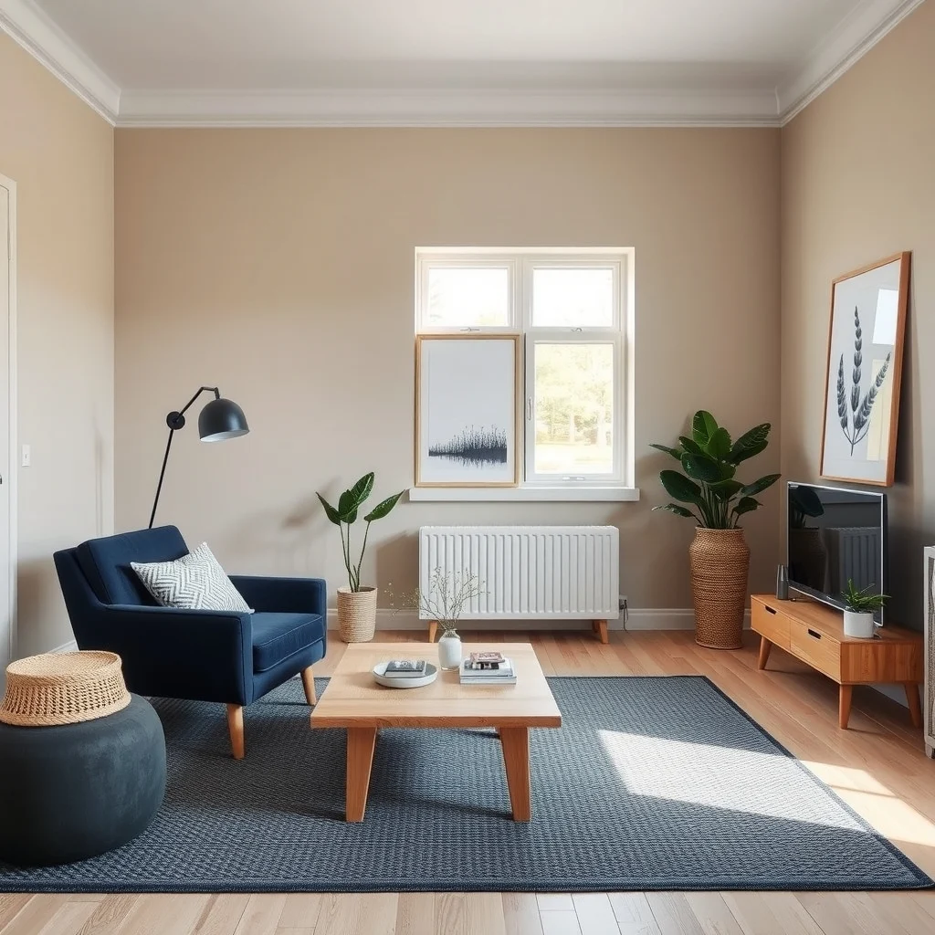
1. Soft Greige Walls with Deep Navy Accents
© 2026 AI Illustrator — Inspiration Only
Starting with a warm greige—an elegant blend of gray and beige—provides a neutral backdrop that is both calming and adaptable. When you introduce deep navy through a rug, throw pillows, or a single statement chair, the contrast adds visual weight without shouting. Navy draws the eye, making a plain coffee table appear anchored within a richer setting. To keep the room from feeling heavy, let natural light bounce off the greige walls and balance the darkness with light wood flooring or a light‑colored sofa. This pairing works especially well in living rooms that receive morning sun, as the navy will appear softer as the day progresses.
What’s Your Apartment Decor Style?
Answer these quick questions to discover your perfect decor vibe.
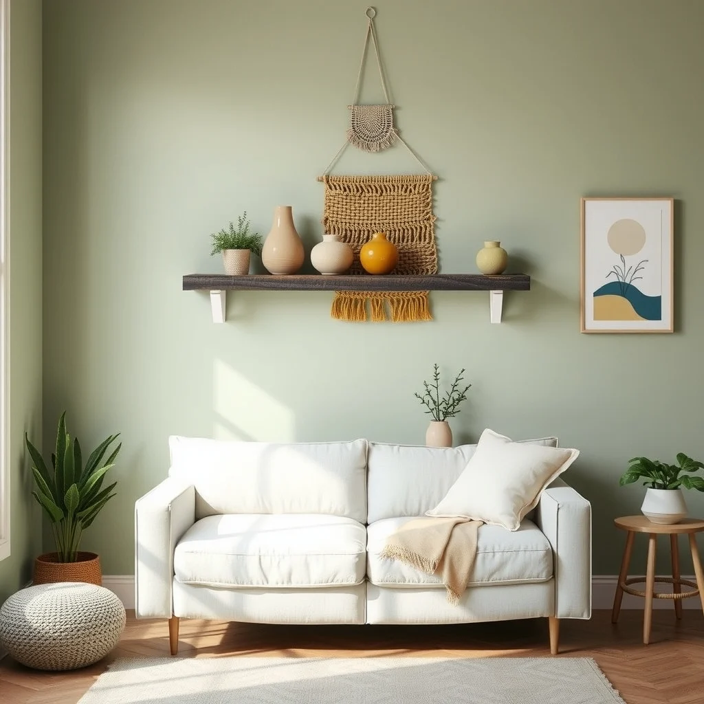
2. Misty Sage Green Walls Complemented by Warm Mustard Highlights
© 2026 AI Illustrator — Inspiration Only
A misty sage green brings an organic, slightly muted feel that pairs beautifully with the unexpected pop of mustard. Paint the larger surfaces in sage, then add mustard through a woven wall hanging, a set of ceramic vases, or a modest side table. The warm yellow tones lift the green, preventing it from feeling too cool, while the green tones down the brightness of mustard, creating a balanced dialogue. In a bedroom, this combination can make a simple metal frame bed feel more grounded; a mustard‑colored throw blanket becomes a focal point rather than a stray accent. Keep window treatments in a light natural linen to maintain airflow and avoid visual clutter.
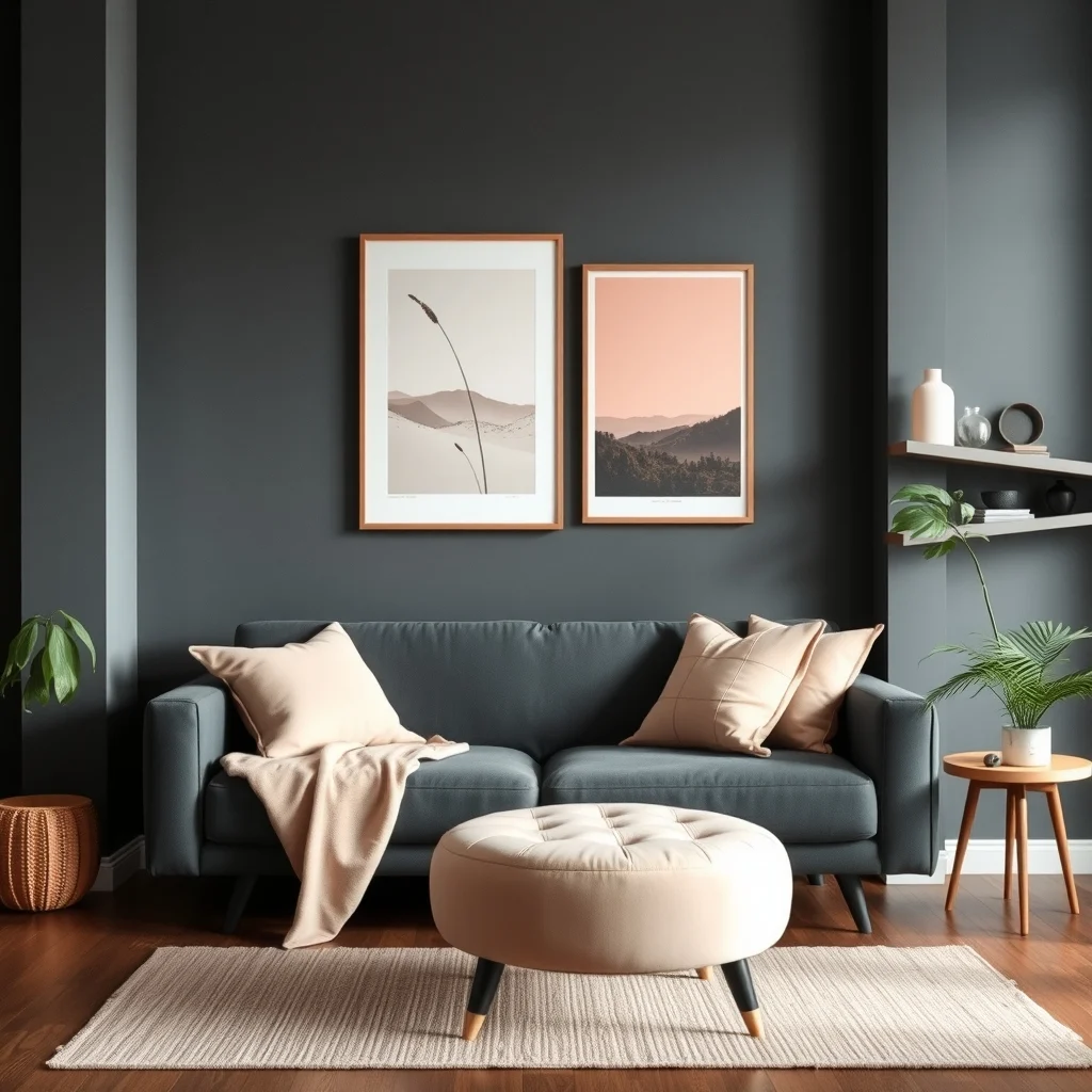
3. Charcoal Gray Walls Paired with Soft Blush Pink
© 2026 AI Illustrator — Inspiration Only
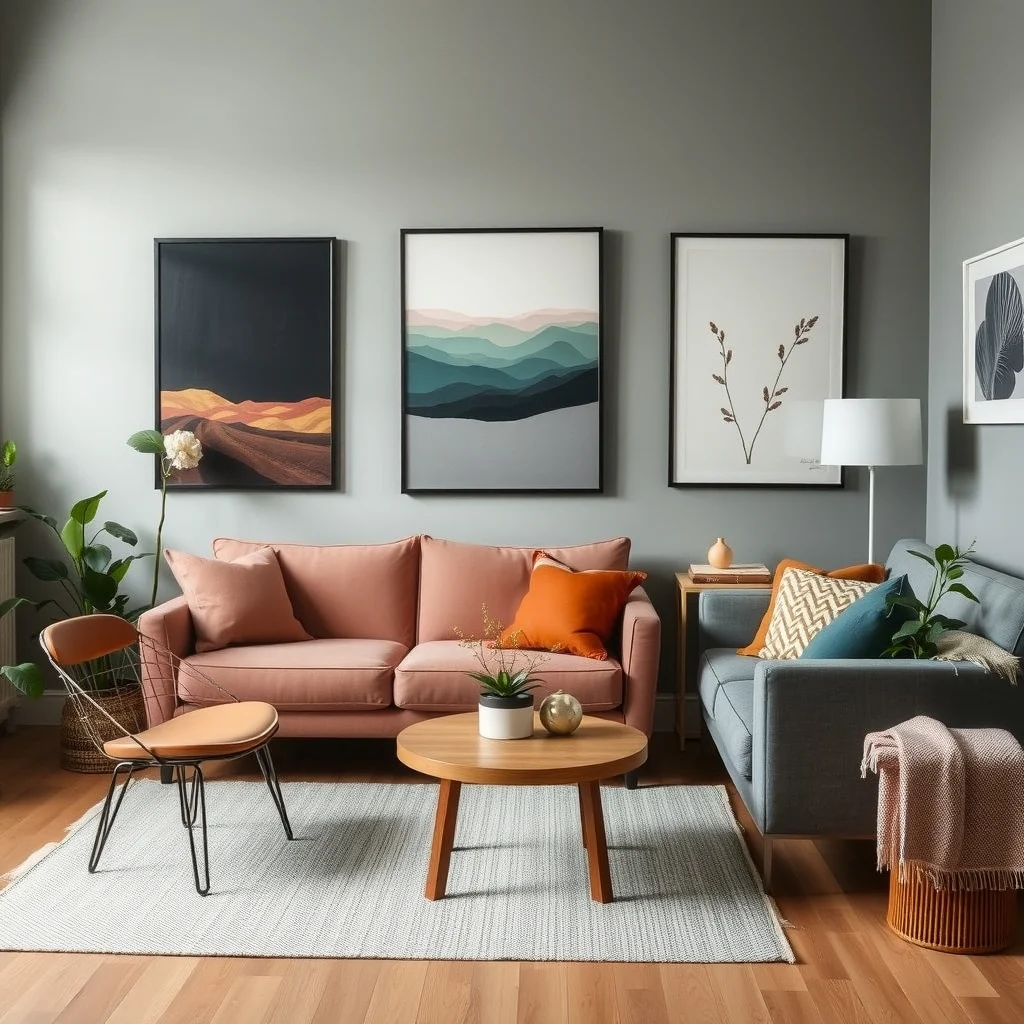
Charcoal gray offers a dramatic canvas that can make a modest sofa appear sleek and contemporary. Introducing soft blush pink through cushions, a small ottoman, or a set of framed prints adds a gentle warmth that softens the intensity of the dark walls. The pink does not compete with the gray; instead, it provides a subtle contrast that draws attention to the furnishings themselves. In a studio apartment, this duo can delineate a sitting area from a workspace without the need for additional partitions. To prevent the space from feeling cramped, incorporate a few metallic accents—such as brushed brass lamp bases—that reflect light and add a touch of refinement.
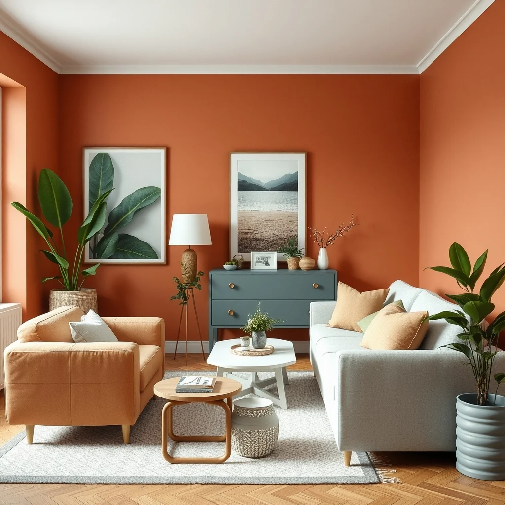
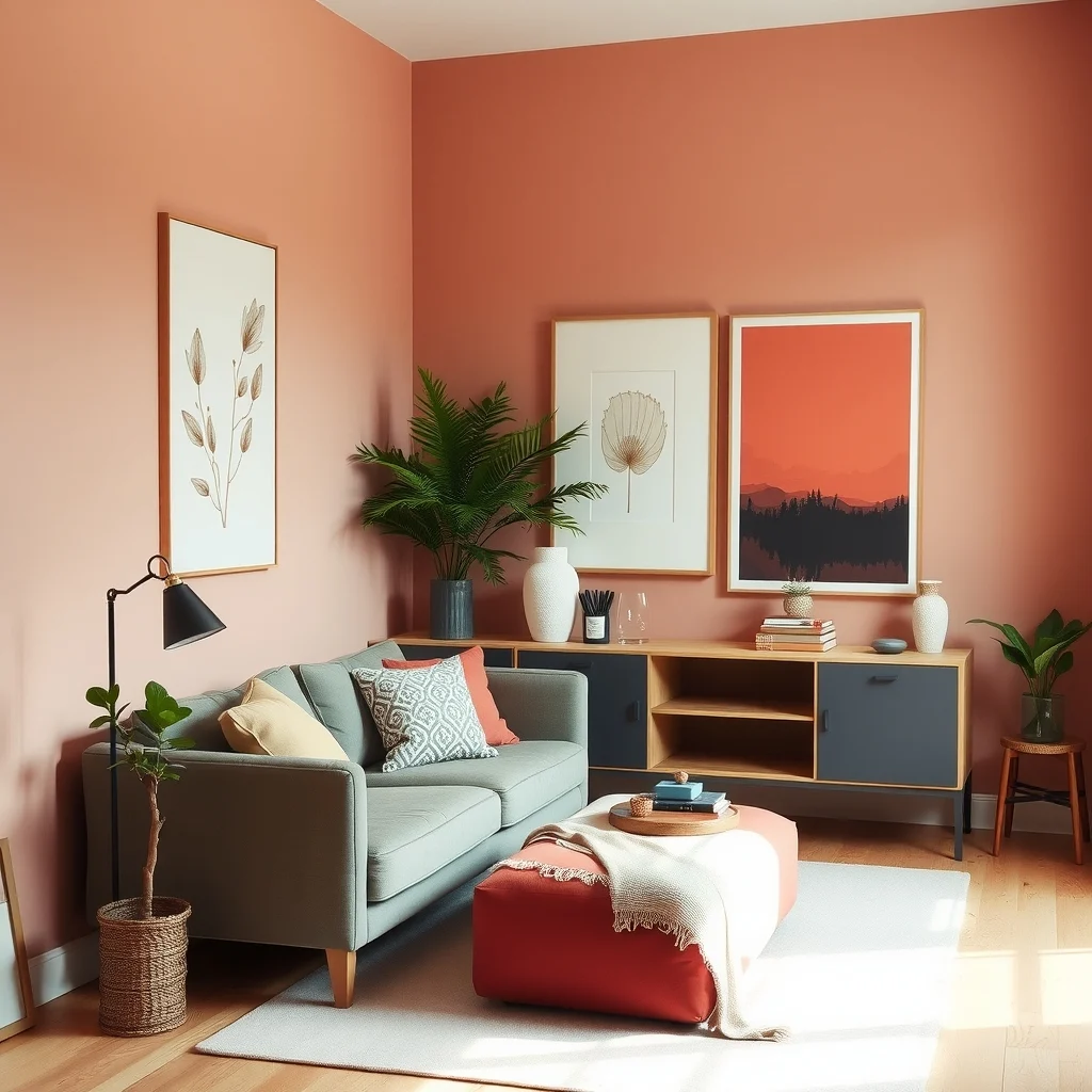
4. Light Terracotta Walls with Cool Slate Accents
© 2026 AI Illustrator — Inspiration Only
Light terracotta evokes the earthy tones of sun‑warmed clay, creating an inviting atmosphere that feels both rustic and modern. Pair this with cool slate—through a patterned rug, a set of slate‑colored drawer pulls, or a modest sideboard—to introduce a grounding, almost stone‑like quality. The contrast between warm and cool tones creates depth, allowing a budget-friendly wooden bookshelf to appear part of a curated design scheme. In a kitchen nook, terracotta walls combined with slate countertops can make inexpensive laminate cabinets feel upscale. Add a few potted herbs on the windowsill to bring a touch of greenery that ties the two hues together.
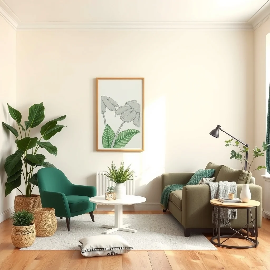
5. Creamy Ivory Walls Combined with Rich Emerald Green
© 2026 AI Illustrator — Inspiration Only
Creme ivory offers a bright, airy foundation that reflects light and makes a room feel larger. When you sprinkle rich emerald green through a velvet armchair, a set of decorative bowls, or a patterned curtain, the result is a luxurious pop that feels purposeful. Emerald’s deep saturation brings a sense of elegance that lifts even a simple laminate dining table. This combination works well in dining areas where the ivory walls keep the space feeling open, while the emerald adds a sophisticated focal point. To ensure the green does not overwhelm, keep the floor covering in a neutral tone and use clear glass accessories that allow the colors to breathe.
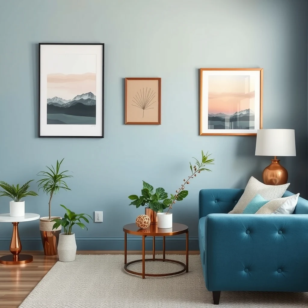
6. Dusty Blue Walls with Warm Copper Details
© 2026 AI Illustrator — Inspiration Only
Dusty blue, reminiscent of a muted sky, provides a soothing backdrop that pairs naturally with the warmth of copper. Paint the main walls in this muted blue, then incorporate copper through lamp bases, picture frames, or a modest coffee table with copper legs. The metallic sheen catches ambient light, adding a subtle sparkle that makes cheap furniture appear thoughtfully selected. In a home office corner, the blue reduces visual noise, while copper accents lend a sense of refinement to a basic desk. Balance the metallic shine with soft textiles—like a linen rug or a cotton throw—to keep the space comfortable.
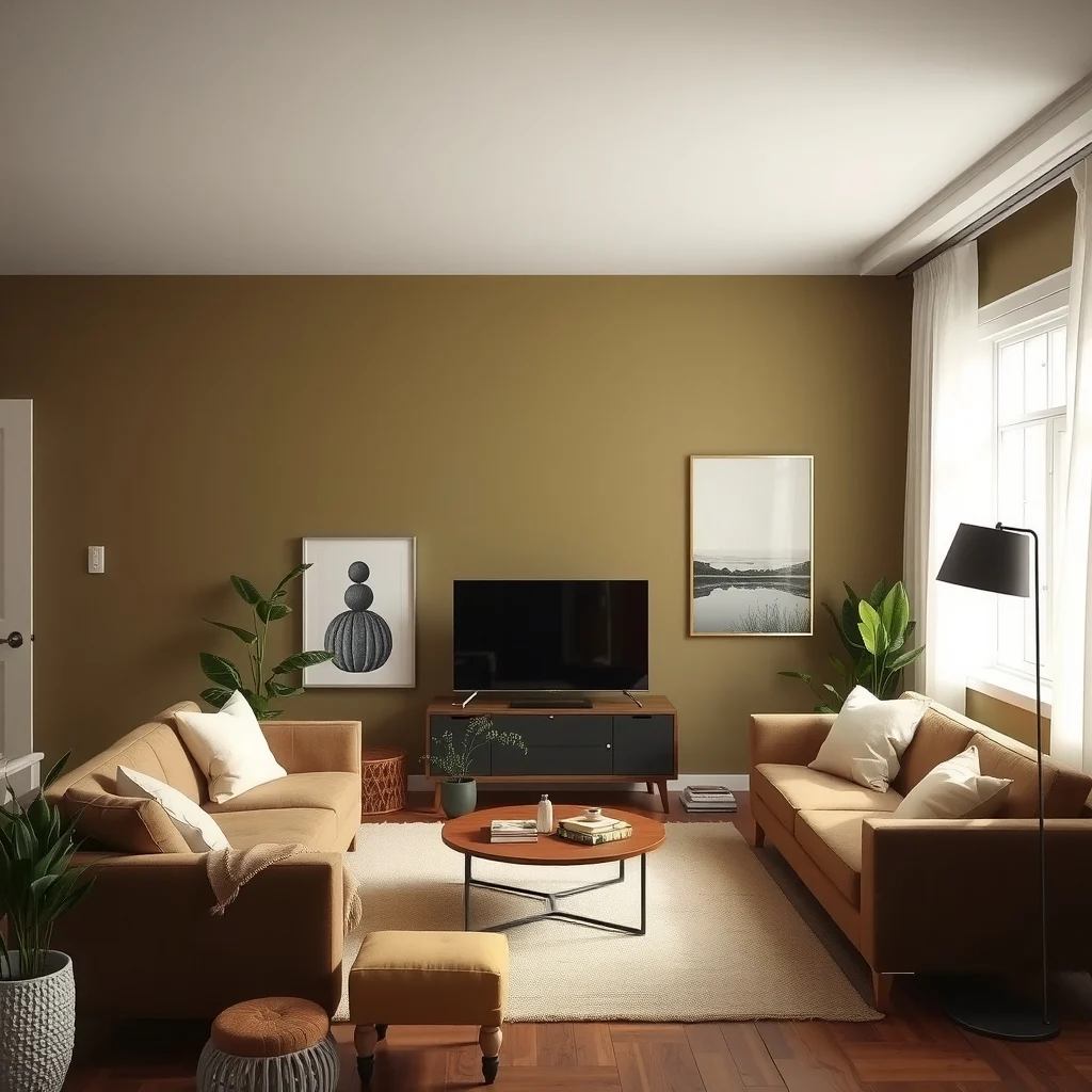
7. Warm Olive Walls with Soft Cream Accents
© 2026 AI Illustrator — Inspiration Only
Warm olive offers a grounded, slightly earthy tone that can transform a plain living area into a space with character. Adding soft cream through curtains, a rug, or a set of upholstered cushions lightens the palette and prevents the olive from feeling too heavy. The cream acts as a visual pause, allowing the eye to rest before moving on to other elements such as a budget-friendly bookshelf or a simple TV stand. In a hallway, this pairing can guide foot traffic smoothly, as the olive draws the eye forward while the cream provides a calming contrast. Incorporate a few natural wood accessories to echo the olive’s organic vibe.
FAQ
© 2026 AI Illustrator — Inspiration Only
Can I use these color combos in a studio apartment?
Yes, each pairing is adaptable to studio layouts; just be mindful of scale and keep the overall palette light to avoid crowding.
Do I need to repaint the entire apartment to achieve these looks?
No, you can limit paint to the main living area or accent walls and rely on textiles and accessories to introduce the complementary hues.
How do I choose between matte and glossy finishes for the walls?
Matte finishes hide imperfections and create a softer feel, while glossy finishes reflect more light; consider the amount of natural light and the mood you want to set.
What’s the best way to incorporate metallic accents without looking cheap?
Choose brushed or antiqued finishes and pair them with natural materials like wood or linen; this contrast elevates the overall aesthetic.
Are there any colors I should avoid if my furniture is very light?
Avoid overly dark walls that can make light furniture appear lost; instead, select mid‑tone backgrounds that provide enough contrast without overwhelming the piece.
Final Thoughts
© 2026 AI Illustrator — Inspiration Only
Color is a powerful, budget‑friendly tool that can transform an apartment and give inexpensive furniture a sense of purpose. By thoughtfully selecting complementary hues and layering them through paint, textiles, and accessories, you can craft an environment that feels cohesive and refined. Experiment with the combinations presented here, adjust them to suit the amount of natural light and your personal taste, and watch how a simple shift in palette reshapes the entire feel of your home.