Advertisement
My apartment used to feel like a beige shoebox with commitment issues. Now? It’s cozy, functional, and looks way more expensive than it is. Here’s exactly what I changed—no gut renovations, just smart, real-life upgrades you can actually do this weekend.
1. Edited Ruthlessly, Then Styled What Was Left
© 2025 AI Illustrator — Inspiration Only
Before I bought a single “cute” thing, I removed all the visual noise. Half-empty candles, random cords, five mugs on the counter—gone. I wasn’t trying to live like a monk, just clearing space so the good stuff could shine.
What’s Your Apartment Decor Style?
Answer these quick questions to discover your perfect decor vibe.
How I Simplified Without Going Minimalist
- One-in, one-out rule: If a new throw pillow comes in, an old one leaves. Harsh but effective.
- Hide the ugly: A small lidded basket now holds remotes, chargers, and that cursed tangle of earbuds.
- Centerpiece strategy: Each surface gets one styled moment—tray + candle + greens. Done.
Once I edited, the apartment instantly felt calmer. It’s amazing what happens when you can actually see your coffee table.
2. Layered Lighting Like a Movie Set (Without Hollywood Prices)
© 2025 AI Illustrator — Inspiration Only
My ceiling light was giving interrogation room vibes. I added three more light sources and suddenly my place looked curated, not cave-like. FYI: lighting is 80% of the vibe, IMO.
The Three-Layer Lighting Formula
- Ambient: A warm-toned floor lamp softened the whole room. Look for fabric shades—instant coziness.
- Task: A pivoting desk lamp made work corners usable and cute. Bonus: brass = glow-up.
- Accent: A plug-in sconce beside the sofa created a “reading nook” in 10 minutes.
I swapped to 2700K warm LED bulbs and added a couple of smart plugs so all the lights turn on together. It’s giving boutique hotel energy—without the minibar prices.
3. Chose a Color Story (Then Actually Stuck to It)
© 2025 AI Illustrator — Inspiration Only
Before, my place was a color free-for-all. Now it’s grounded in a simple palette: warm neutrals + olive + black accents. Everything finally talks to each other—no one’s screaming.
My Palette Playbook
- Base: Soft beige/greige textiles to warm up rental-white walls.
- Accent: Olive cushions and a throw. Green = fresh without trying too hard.
- Anchor: Black frames and a matte black floor lamp to add definition.
When I shop now, I check: does it fit the palette? If not, it’s a no. My apartment looks cohesive because I stopped freelancing with colors.
4. Elevated the Windows (And Faked Taller Ceilings)
© 2025 AI Illustrator — Inspiration Only
My windows weren’t small—they just looked stunted. I raised my curtain rods to 4–6 inches above the frame and widened them so the drapes hang outside the glass. Boom: instant architecture.
Window Dressing Wins
- Floor-kissing length: Curtains that barely touch the floor feel luxe. No high-water hemlines.
- Textured panels: Linen-blend for softness and movement. Avoid shiny synthetics—cheap at first glance.
- Layered look: Sheer roller shade + curtains = privacy and glow, not cave and gloom.
The space feels taller and more finished, like I accidentally hired a stylist. Highly recommend this one if you’re renting.
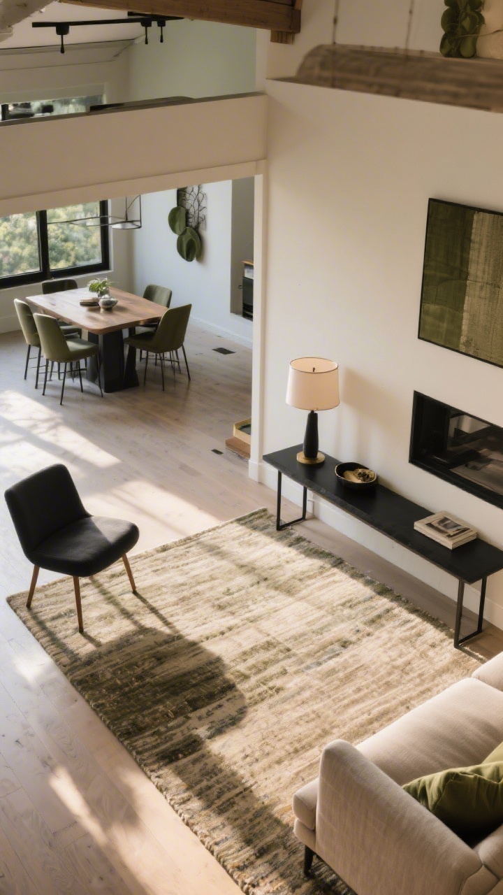
5. Zoned the Space With Rugs and Furniture (Goodbye, Floating Island Syndrome)
© 2025 AI Illustrator — Inspiration Only
Open-plan layouts can feel like a lost luggage claim. I used area rugs and intentional furniture placement to create zones: living, dining, and “work”—even though it’s one room.
Layout Changes That Worked
- Right-sized rug: Front sofa legs on the rug, chair legs too. Suddenly the seating area felt like a real room.
- Slim console behind the sofa: Visually separates living from dining and gives a spot for a lamp and catchall.
- Floating furniture: Pulled the sofa 6 inches off the wall. Counterintuitive, but the room felt bigger.
Dividing your space on purpose makes everything feel intentional. No more awkward furniture drift.
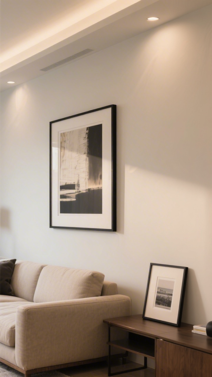
6. Swapped Art Chaos for Big, Bold Moments
© 2025 AI Illustrator — Inspiration Only
Ten tiny frames were cluttering my walls and my soul. I replaced them with fewer, larger pieces and it was an instant glow-up. Think: one big statement over the sofa, not a collage of “meh.”
Art That Looks Expensive (But Isn’t)
- Scale up: 24×36 or bigger for main walls. Go beyond “poster size.”
- DIY frames: IKEA frames + custom matting = custom look without crying at the framer’s.
- Visual rest: Leave some walls blank. White space is part of the design, FYI.
I also layered a framed print on the console against the wall—casual, European, and no holes to patch later.
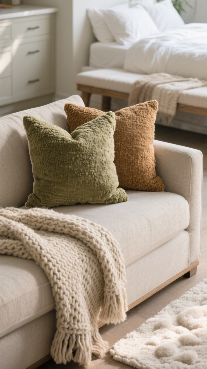
7. Upgraded Textiles: The Fastest Cozy You Can Buy
© 2025 AI Illustrator — Inspiration Only
Textiles are your apartment’s handshake. I upgraded a few key pieces and the whole vibe went from “first dorm” to “first mortgage,” minus the actual mortgage.
The Textile Trio That Changed Everything
- Throw pillows with inserts: Down or down-alternative inserts + linen or bouclé covers. Chop if you must, but quality inserts matter.
- Weighted throw: A chunky knit in a neutral tone. Texture = depth, not just decor fluff.
- Better bedding: Crisp percale sheets, a duvet with ties, and two extra shams. Hotel-bed vibes nightly.
I also added a runner in the kitchen and a soft bath mat that feels like a cloud. Micro-upgrades, macro-comfort.
Bonus Mini Tweaks That Pulled It Together
- Hardware swap: Matte black cabinet pulls and matching door stops. Ten minutes, big payoff.
- Greenery: A tall fiddle leaf fig (fake, because I’m honest) for height and life.
- Signature scent: One candle, one diffuser. Consistent scent makes the space feel intentional.
These seven upgrades made my apartment feel calm, stylish, and very me—without a renovation or a meltdown. Start with one section, then stack the changes. Your place doesn’t need more stuff; it needs the right stuff, in the right spots. You’ve got this—now go make your home 10x better too.