Cozy Farmhouse Paint Colors: Embracing a Neutral Color Palette
So, there I was, snuggled up in my favorite oversized sweater (you know, the one that kinda resembles a cozy blanket?), clutching a cup of coffee so hot it could melt steel. The sunlight was filtering through the kitchen window, pooling like melted butter on my wobbly farmhouse table, and all I could think about was how desperately my living room needed a makeover. Don’t get me wrong; I love my little nook, where a stack of books balances precariously on a side table, but the walls? Let’s just say they were begging for a little TLC.
When it comes to transforming a space, the very first thing we should consider is the color palette. Farmhouse paint colors, especially those delightful neutral shades, can breathe fresh life into even the most outdated areas. Imagine that unexpected burst of tranquility washing over you as you step into a sun-soaked room adorned in soft, warm whites, beige, and taupe. Sigh… perfection, right?
© 2025 AI Illustrator — Inspiration Only
What’s Your Apartment Decor Style?
Answer these quick questions to discover your perfect decor vibe.
In this cozy post (sweatpants and all), let’s explore how a neutral color palette can create a warm, inviting home vibe, and I’ll share some tips, tricks, and maybe a story or two along the way (who doesn’t love a good ramble about paint?).
1. Embrace Soft Whites
If there’s one color that makes my heart swoon, it’s soft white. Now, don’t get me wrong; I’m not talking about those glaring, hospital-like whites that feel more sterile than serene. I’m thinking about dreamy, creamy whites that invite light in and create a warm embrace. You can achieve a lovely farmhouse feel with whites like Benjamin Moore’s Simply White or Sherwin-Williams’ Alabaster.
Picture this: your living room walls clad in soft white, with sunlight pouring in through sheer linen curtains. There’s a rustic wooden beam overhead, and maybe a vintage chandelier hanging, adding just the right amount of charm. Oh, and let’s not forget the little vase filled with freshly cut wildflowers on the coffee table. That’s what I call an Instagram moment!
2. Add Cozy Beige Hues
Okay, confession time: beige can be so much more than “blah.” It can actually be a star player in your neutral color palette, adding warmth without overwhelming the senses. Think of it as that reliable friend who always brings snacks to movie night. Soft beiges can pull a space together, making it feel grounded and inviting.
Two of my favorites are Revere Pewter by Benjamin Moore and Accessible Beige by Sherwin-Williams. Imagine a cozy corner in your living room where you snuggle up with a book; the walls are painted in a soft beige that complements a gorgeous chocolate-brown couch and the little nook by the window that’s perfect for enjoying a lazy Sunday. It’s all about layering those neutral tones to create the perfect vibe!
© 2025 AI Illustrator — Inspiration Only
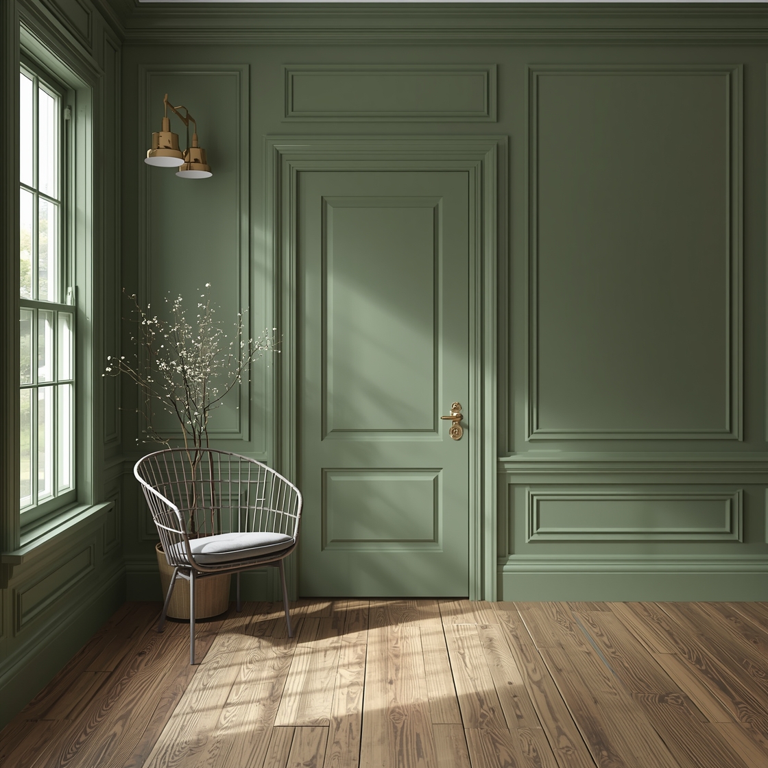
3. Subtle Greys for a Modern Touch
Who says a farmhouse can’t have a modern edge? Enter soft greys: the chic cousins of the earthy tones. They pair beautifully with wood accents and greenery, bringing just enough contemporary flair to keep things interesting. A lovely shade like Repose Gray by Sherwin-Williams can make your space feel fresh and airy.
Let’s set the scene: Imagine a light grey entryway with hooks for coats, a rustic bench dressed in soft plaid throw pillows, and a gallery wall of family photos. Every time you come home, the soft grey walls signal, “Welcome, this is your safe haven.” And let’s be real—who wouldn’t want that?
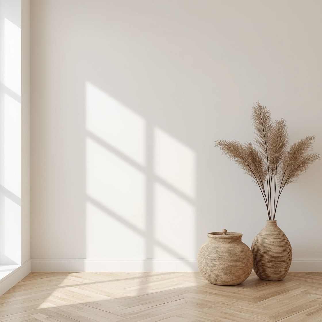
4. Earthy Taupes for a Warm Embrace
Alright, let’s talk taupe—it’s like the cozy cardigan of the color world. It’s warm, earthy, and can be so versatile. Using shades like Pavement by Benjamin Moore can really give your home that grounded, natural feel. Picture a beautiful, taupe-hued dining room, adorned with reclaimed wood tables and mismatched chairs. There’s nothing staged about it; it’s just cozy and inviting.
And can we take a moment to appreciate how beautifully taupe pairs with greenery? A little potted plant here, a fresh herb garden there—suddenly, it’s not just a room; it’s a sanctuary.
© 2025 AI Illustrator — Inspiration Only
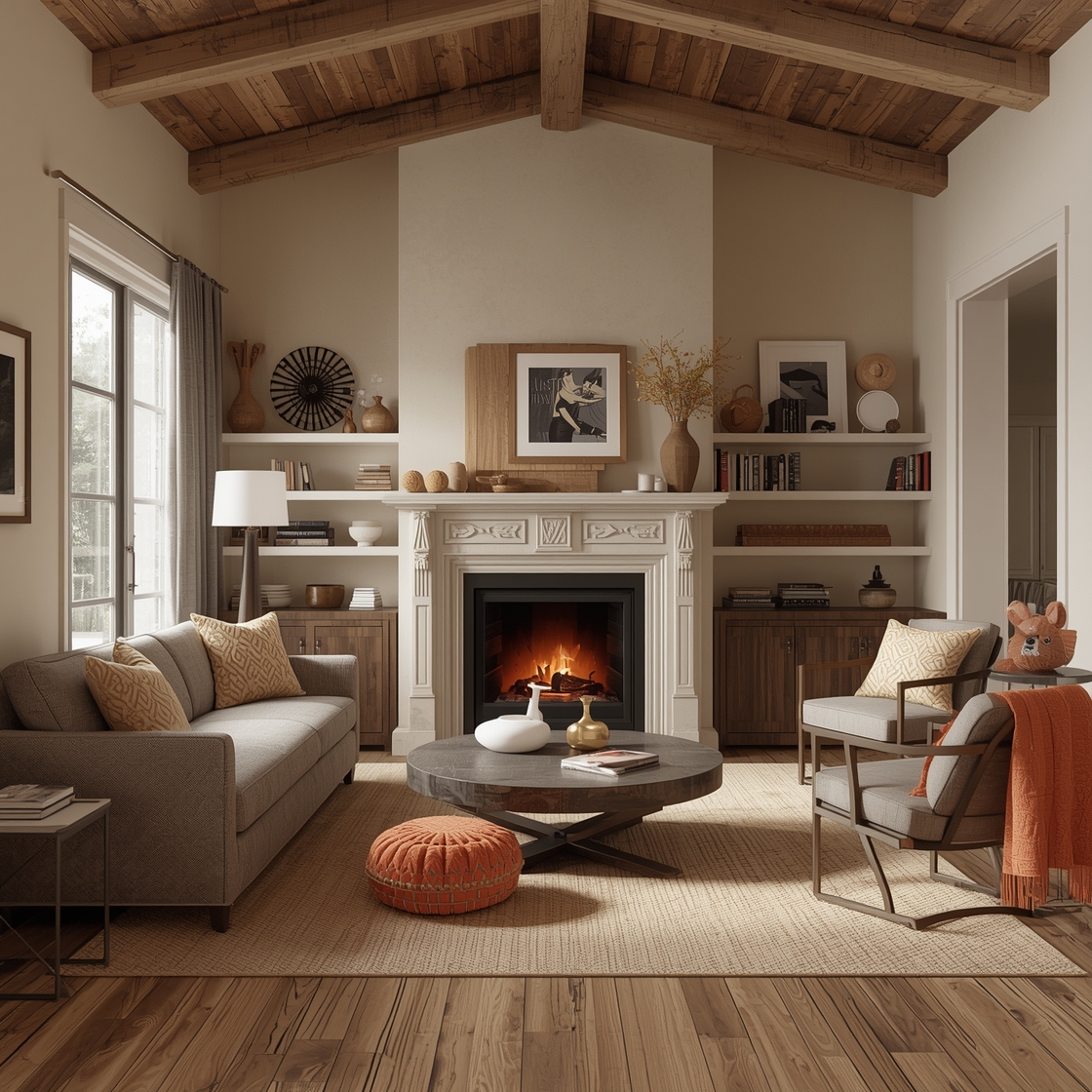
5. Textures Matter: Layering is Key
Now, let’s talk texture because with a neutral color palette, it’s all about layering different materials to create visual interest. Soft knitted throws, rustic baskets, and even a chunky jute rug can take your pretty painted walls and elevate the whole vibe.
Imagine a neutral color palette with a creamy white wall, a taupe sofa draped in a faux fur throw, and a floor covered in a sandy jute rug. Your living room instantly feels more inviting, a little messy (in a good way), and oh-so-comfortable. Don’t be afraid to mix and match! It’s all about creating that lived-in look.
6. Accent Walls—One Small Change, Big Impact
Feelin’ bold but still vibing with neutrals? Consider an accent wall! This is like the adventurous update to your neutral town. Choose a deeper shade from your palette (maybe a cozy charcoal gray or a rich taupe), and let it be the star of the show.
Imagine your kitchen with soft white cabinets and a charcoal accent wall behind the stove. Honestly, it’s like I can smell the baked goods wafting through the air already. Is there anything better than fresh-baked cookies in a beautifully designed kitchen? I think not!
© 2025 AI Illustrator — Inspiration Only
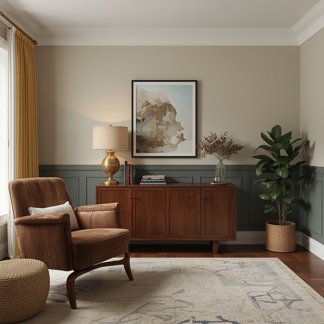
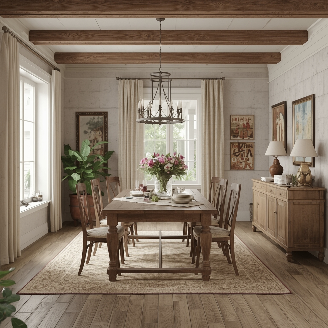
7. Balance with Warm Accents
Okay, let’s wrap things up with a cherry on top: warm accents! Think of earthy tones mixed with metals and wood. Add a touch of copper or brass through light fixtures and maybe a wooden mirror. It’s these little touches that will make your neutral color palette truly shine!
Imagine a dining room with bleached wood tables, surrounded by comfortable upholstered chairs in taupe, all highlighted by warm, golden lighting. Set the mood, add a soft runner down the center of the table, and overlay the whole scene with neutral-colored dinnerware. It’s both dreamy and functional.
© 2025 AI Illustrator — Inspiration Only
Conclusion: Your Neutral Color Palette Awaits!
And there you have it—my ramblings on how to embrace the magic of farmhouse paint colors through a neutral color palette. Just picture the joy of coming home to a just-painted room, drenched in soft whites, beiges, and cozy greys.
So, the next time you feel overwhelmed by decisions, remember: you don’t have to complicate things. Look for colors that whisper comfort and warmth, that speak the language of coziness, and add those little personal nuances that make a house a home.
Now, if you’ll excuse me, my laundry isn’t going to fold itself. But maybe after one more cup of coffee…
© 2025 AI Illustrator — Inspiration Only