
Living in a compact apartment often means every square foot counts, and the visual balance of a room can feel fragile. Wood brings warmth and texture, but when several shades appear together, the space can look busy instead of inviting. This article walks you through seven practical ways to layer different wood tones while keeping the overall feel calm and cohesive. By the end, you’ll have a clear roadmap for selecting pieces, arranging them, and using lighting and accessories to let each element breathe.
1. Choose a Dominant Wood as an Anchor
© 2026 AI Illustrator — Inspiration Only
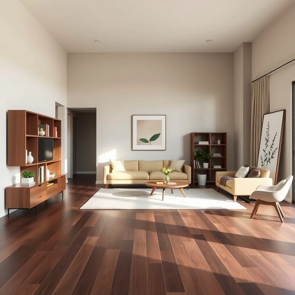
Start by picking one wood tone that will serve as the visual anchor for the apartment. This could be the floor, a large sofa, or a built‑in bookshelf. When the eye first lands on a substantial piece, it establishes a reference point that other woods can relate to. For instance, a medium‑stained oak floor sets a neutral backdrop; a dark walnut coffee table placed on that floor will feel intentional rather than random. The anchor should be the most frequently viewed surface, because it defines the room’s base temperature—warm, cool, or somewhere in between. Once you have that anchor, you can experiment with lighter or darker accents, knowing they will always be tied back to the main tone.
What’s Your Apartment Decor Style?
Answer these quick questions to discover your perfect decor vibe.
One benefit of a clear anchor is that it reduces the need for constant visual comparison; you simply ask, “Does this new piece complement the anchor?” If the answer is yes, the combination is likely to feel harmonious. The trade‑off is that the anchor should be a piece you love, as it will dominate the aesthetic for the foreseeable future.
2. Vary Finish and Texture to Differentiate Tones
© 2026 AI Illustrator — Inspiration Only
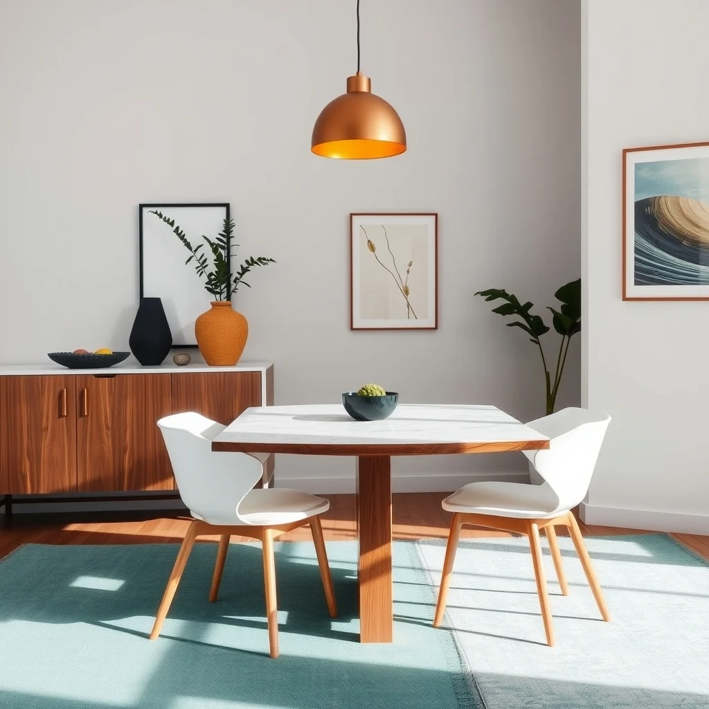
Two pieces of wood can share a similar hue yet feel distinct when their finishes differ. A matte, brushed walnut sideboard next to a glossy, lacquered maple dining table creates depth without adding extra color. The contrast between a smooth veneer and a hand‑scraped surface also catches the eye in a subtle way, allowing each item to stand on its own. Light reflects differently off each finish, which can be especially useful in rooms with limited natural light; a satin finish will soften glare, while a semi‑gloss surface can brighten a darker corner.
When selecting finishes, consider the maintenance routine of each. High‑gloss surfaces show fingerprints more readily, so place them in low‑traffic zones if you prefer minimal upkeep. Conversely, a distressed or oil‑finished piece can hide minor scratches, making it ideal for a busy entryway. By pairing varied textures, you achieve visual interest without crowding the space with additional colors.
3. Use Scale and Placement to Define Separate Zones
© 2026 AI Illustrator — Inspiration Only
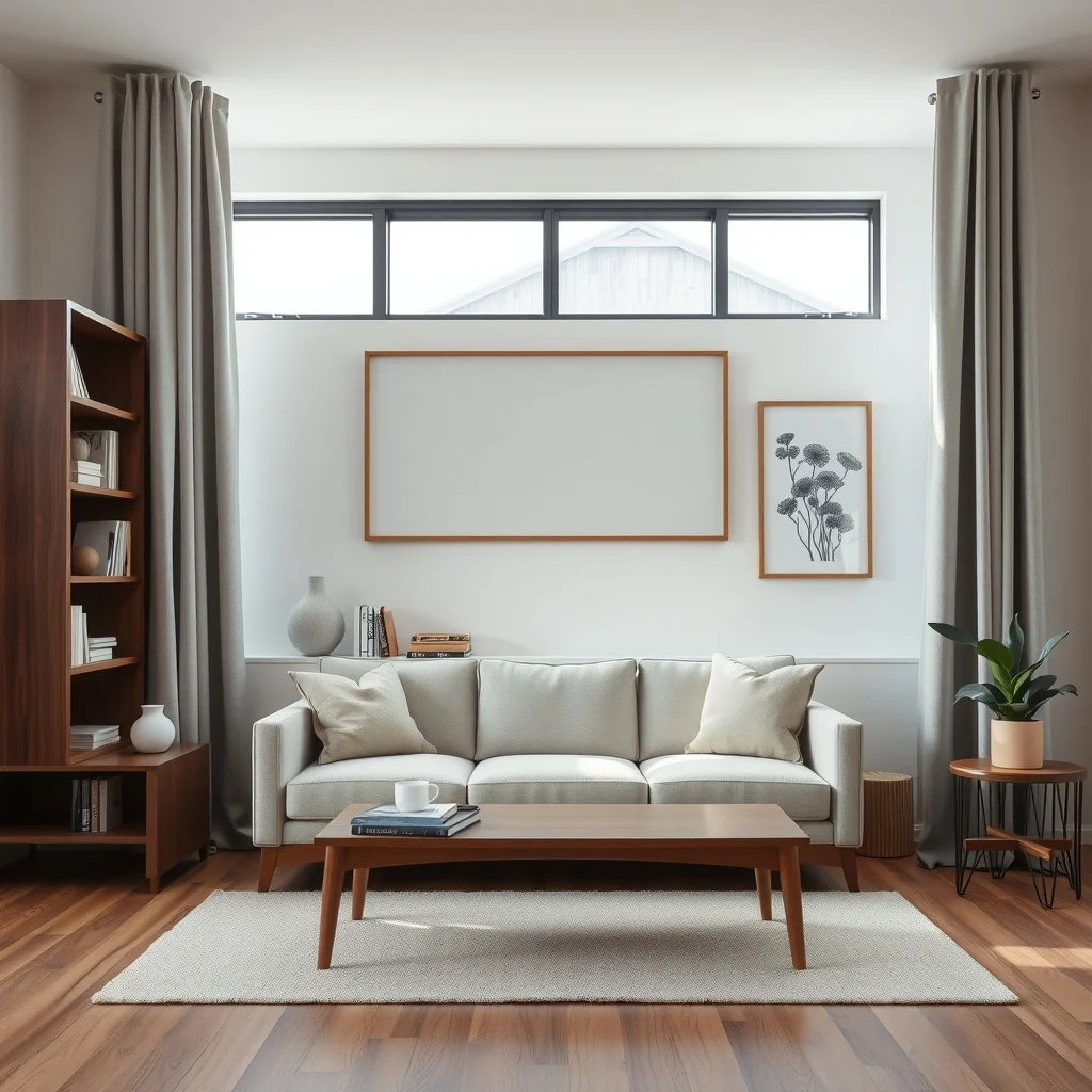
In open‑plan apartments, the arrangement of furniture can act as a silent divider, preventing wood tones from bleeding into each other. A tall, dark walnut bookshelf positioned behind a light pine sofa creates a natural backdrop that separates the living area from a nearby dining nook. The height difference draws the eye upward, while the contrasting tones delineate functional zones without the need for walls or screens.
Pay attention to the proportion of each piece. A bulky, dark cabinet can overwhelm a small room, but when paired with slender, light‑stained chairs, the overall mass feels balanced. If you have limited floor space, consider floating a narrow console against a wall; its placement will break the continuity of the floor’s wood tone, offering a visual pause before the eye moves to the next area. The key is to let each zone have its own dominant wood while still referencing the anchor tone.
4. Introduce Neutral Backdrops That Let Wood Breathe
© 2026 AI Illustrator — Inspiration Only
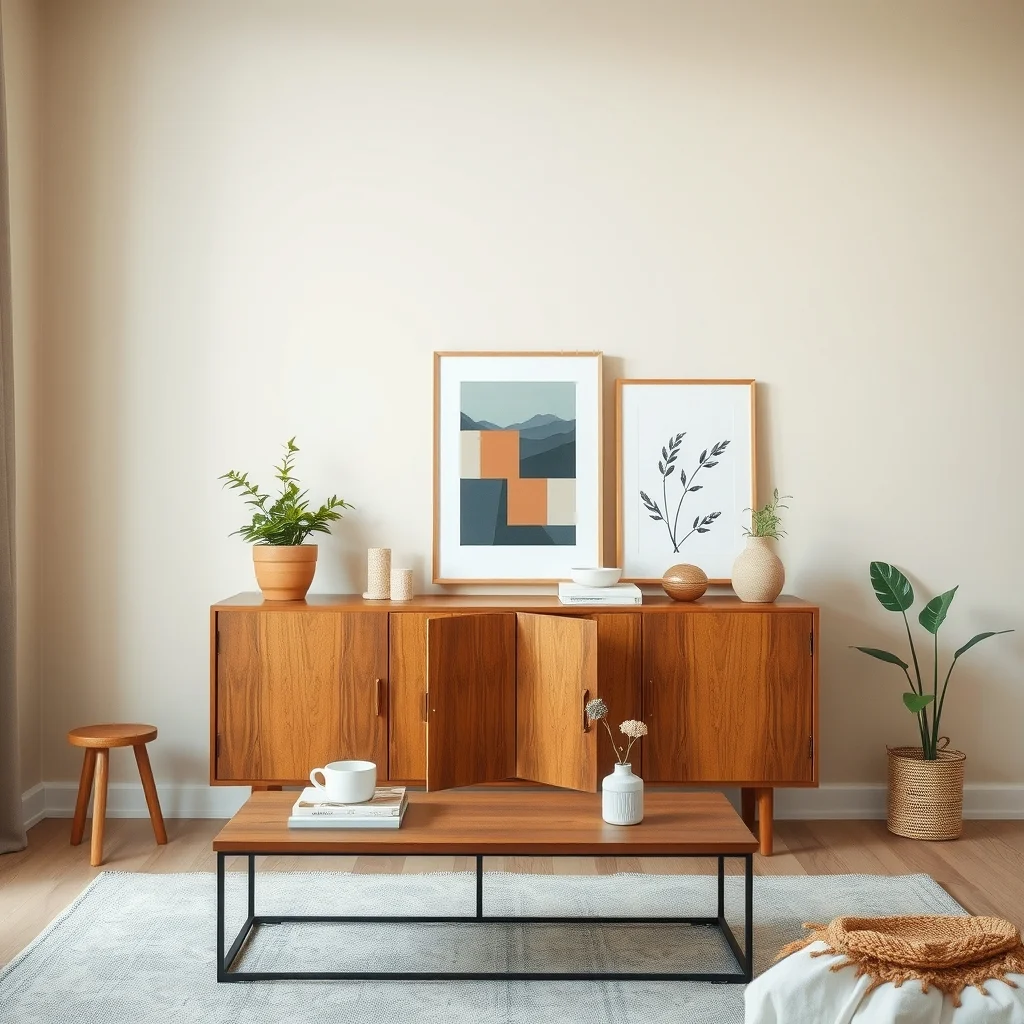
Neutral walls, curtains, or rugs act as breathing room for multiple wood shades. A soft greige wall behind a walnut sideboard and a pine coffee table provides a quiet canvas that prevents the woods from competing for attention. Textiles such as linen drapes in a muted taupe can soften the transition between a dark wooden headboard and a lighter wooden nightstand, especially in a bedroom where the eye moves quickly between surfaces.
Choosing the right neutral involves considering the room’s lighting. In a sun‑lit studio, cooler whites can keep the space feeling airy, while in a dimmer apartment, warmer off‑whites add subtle coziness without clashing with the wood’s natural tones. The downside of a neutral backdrop is that it can sometimes feel flat if not layered with texture; a woven rug or a subtly patterned throw can add just enough visual weight to keep the scene lively.
5. Layer Lighting to Highlight Contrast
© 2026 AI Illustrator — Inspiration Only
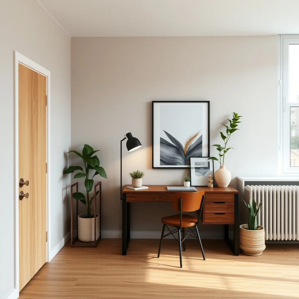
Lighting is a powerful tool for managing how wood tones appear together. Directional floor lamps placed near a dark walnut desk will cast shadows that accentuate its grain, whereas ambient ceiling lights can wash over a light pine side table, making its color appear brighter. By strategically positioning light sources, you can control which wood takes visual priority at different times of day.
Warm‑tone LED bulbs tend to enhance the richness of deeper woods, while cooler bulbs keep lighter woods from looking washed out. If you have a mix of finishes, a combination of task lighting and soft uplighting can bring out both matte and glossy surfaces without overwhelming the eye. Remember that excessive lighting can flatten texture, so aim for a balance that respects the natural variations in each piece.
6. Add Natural Accessories That Echo Wood Hues
© 2026 AI Illustrator — Inspiration Only
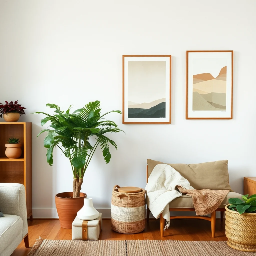
Plants, woven baskets, and ceramic vessels can reinforce wood palettes without adding more timber. A large fern in a terracotta pot mirrors the reddish undertones often found in cherry or mahogany, while a jute basket placed beside a light birch console introduces a subtle, earthy contrast. These accessories act as color bridges, allowing the eye to travel smoothly from one wood tone to another.
When selecting accessories, think about scale and material. A tall, slender bamboo vase can complement a narrow, dark walnut bookshelf without competing for floor space. Conversely, a chunky rattan tray placed on a light oak coffee table can create a tactile dialogue that feels intentional. The trade‑off is that natural materials may require more care—plants need watering, and woven items can collect dust—so choose items that fit your maintenance habits.
7. Keep the Ceiling and Upper Surfaces Consistent
© 2026 AI Illustrator — Inspiration Only
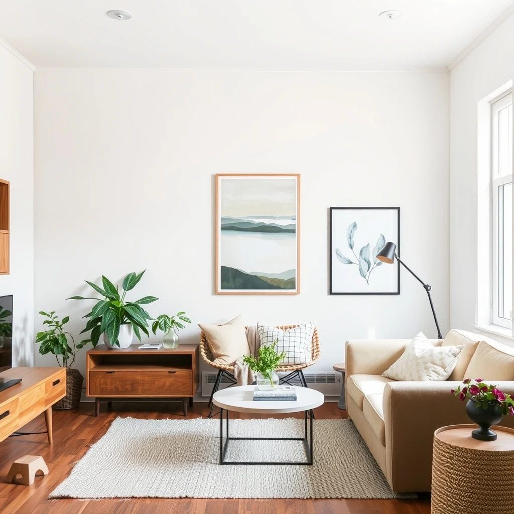
In a small apartment, the ceiling and upper walls are often overlooked, yet they have a strong influence on perceived clutter. Painting the ceiling a crisp white or a very light gray provides a visual lift that prevents the accumulation of wood tones from feeling heavy. When the upper plane stays neutral, the eye can rest, making the varied wood elements below feel organized.
If you enjoy exposed beams, limit them to a single wood species or finish that matches the dominant anchor. This restraint stops the ceiling from becoming a second source of contrast, which could otherwise compete with the floor and furniture. The downside of a neutral ceiling is that it may feel stark in a room with abundant warm woods, so consider adding a subtle texture—such as a fine plaster finish—to retain some depth without reintroducing visual noise.
FAQ
© 2026 AI Illustrator — Inspiration Only
Can I mix dark walnut and light pine in a small studio?
Yes, you can, as long as you anchor the room with one of the tones and use neutral walls to separate them. Placing the darker walnut piece against a light wall helps it stand out without overwhelming the space.
How do I prevent wood tones from clashing with colorful artwork?
Choose artwork that contains at least one color present in the wood palette, such as a warm brown or soft amber. This creates a visual link that ties the pieces together.
Is it okay to have a different wood tone on the ceiling?
Generally, keeping the ceiling neutral is safer for visual balance. If you want wood overhead, limit it to a single, subtle finish that matches the floor or a large piece of furniture.
What finish works best for high‑traffic areas?
A satin or oil‑finished wood tends to hide scratches better than a high‑gloss surface. These finishes also require less frequent polishing, making them practical for entryways and kitchens.
Can I use rugs to separate wood tones?
Rugs in neutral shades or with muted patterns can define zones and give the eye a pause between different wood pieces. Just ensure the rug’s color doesn’t compete with the wood hues you’re trying to balance.
Final Thoughts
© 2026 AI Illustrator — Inspiration Only
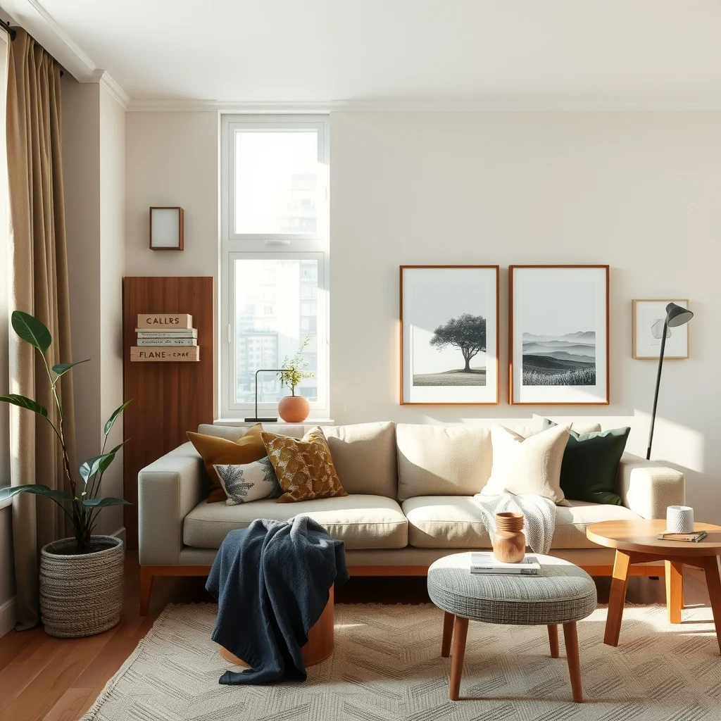
Mixing wood tones in an apartment is less about matching every shade perfectly and more about establishing a clear hierarchy, using texture, lighting, and neutral backdrops to guide the eye. By anchoring the space with a dominant wood, varying finishes, arranging furniture to create zones, and supporting the palette with natural accessories, you can enjoy the richness of multiple woods without feeling boxed in. Remember that each decision—whether it’s a floor finish or a ceiling color—affects the overall rhythm of the room. With thoughtful placement and a few guiding principles, your apartment can showcase a layered, inviting wood landscape that feels both curated and comfortable.