Advertisement
Let’s be real: some apartments just scream “starter pack” even when you’re trying so hard for chic. The good news? Most “cheap-looking” vibes come from small details you can fix in a weekend, without torching your budget. Ready to level up your space from rental-basic to effortlessly polished?
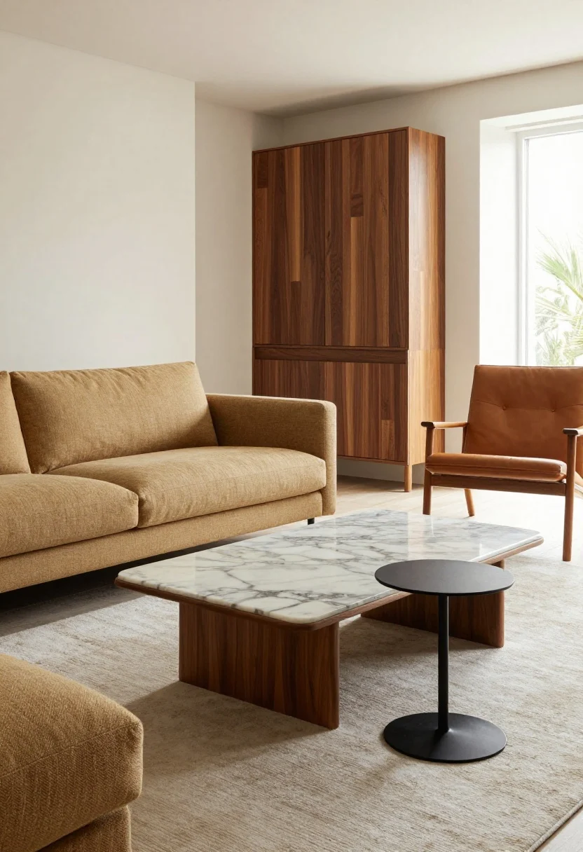
1. Matchy-Matchy Furniture Sets
© 2025 AI Illustrator — Inspiration Only
That perfectly coordinated sofa-coffee table-TV stand trio? It feels safe—but also a little, uh, showroom. Rooms look richer when pieces feel collected over time, not bought in one swoop.
What’s Your Apartment Decor Style?
Answer these quick questions to discover your perfect decor vibe.
Smart Fix
- Mix materials: Pair a fabric sofa with a wood coffee table and a metal side table.
- Swap one piece: If you own a full set, replace the coffee table or side table with a vintage or marble-topped option.
- Introduce contrast: Use different wood tones (walnut + oak) and add a soft rug to break up sameness.
Pro tip: Add a unique accent chair—cane, boucle, or leather—to instantly look curated, not catalog.
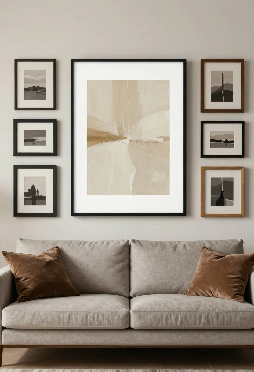
2. Tiny Art Hung Too High
© 2025 AI Illustrator — Inspiration Only
Postcard-size art floating alone on a big wall looks like a mistake. And if it’s hung near the ceiling? Even worse. Art should feel anchored and intentional.
Smart Fix
- Right size, right height: Center art at about 57–60 inches from the floor—museum height.
- Go bigger or go gallery: Use one large piece (at least two-thirds the width of your sofa) or a gallery wall with consistent frames and varied sizes.
- Frame glow-up: Ditch flimsy frames. Go for wood, metal, or a sleek black frame with a mat to elevate prints.
FYI: Oversized art doesn’t have to be expensive—engineer prints, thrifted canvases, or DIY abstracts look great when framed well.
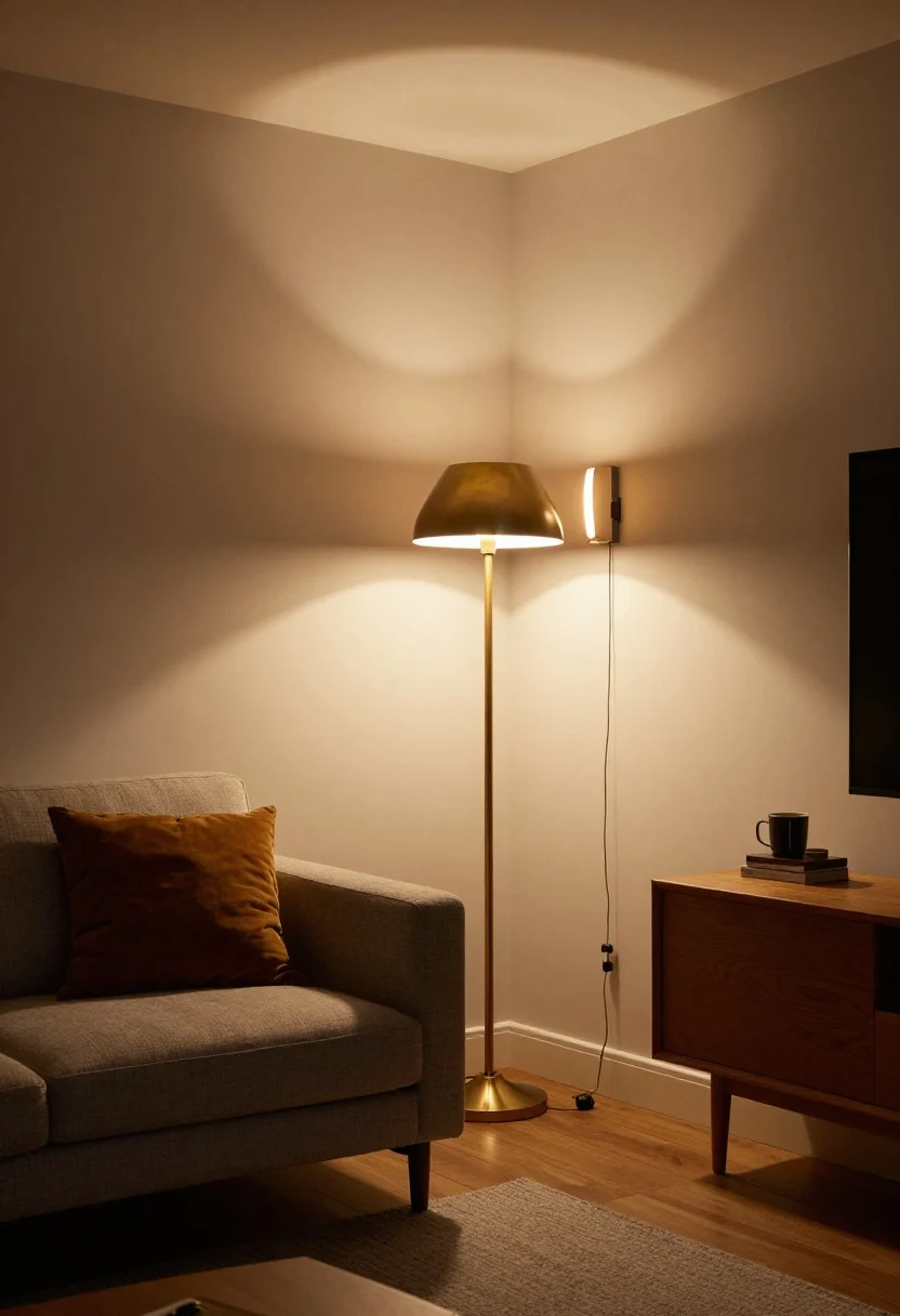
3. Harsh Overhead Lighting Only
© 2025 AI Illustrator — Inspiration Only
If your apartment glows like a classroom, it’s dating itself. Overhead-only lighting is flat and unforgiving, and it makes furniture and skin tones look dull.
Smart Fix
- Layer lighting: Aim for three light sources per room—overhead, task (floor/desk lamps), and accent (sconces/candles).
- Swap bulbs: Choose warm white LEDs (2700–3000K) with a high CRI (90+) for better color accuracy.
- Plug-in sconces: Add instant architecture without hardwiring. Hide cords with cord covers painted to match the wall.
Bonus: Use dimmers or smart plugs to change the mood from “work mode” to “wine o’clock.”
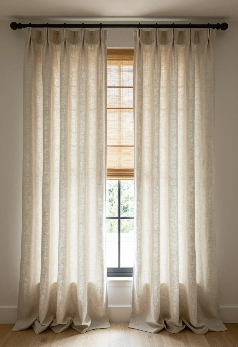
4. Bare Windows Or Shiny, Cheap Blinds
© 2025 AI Illustrator — Inspiration Only
Naked windows or flimsy vinyl blinds make even good furniture look sad. Window treatments are like eyeliner—suddenly everything’s defined.
Smart Fix
- Hang high and wide: Mount rods 4–6 inches above the window and extend 6–10 inches past each side to make windows look bigger.
- Choose fabric wisely: Linen blends, cotton twill, or textured weaves fall beautifully. Skip thin polyester that clings.
- Double up: Pair shades (Roman or bamboo) with curtains for depth and privacy.
Look for: Matte black or brass rods with substantial finials—hardware matters more than you think.
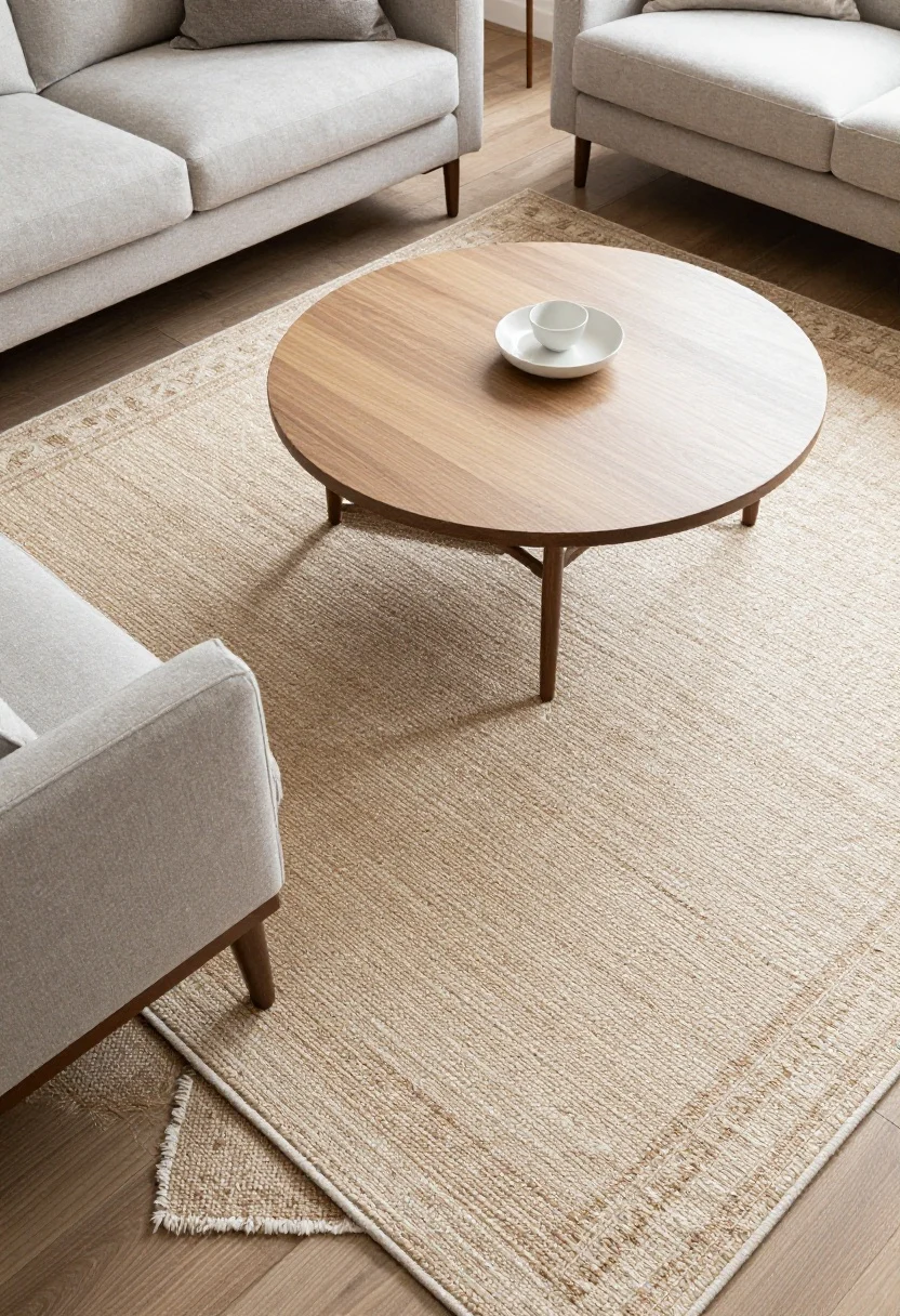
5. Too-Small Rugs (The Classic Oops)
© 2025 AI Illustrator — Inspiration Only
A tiny “postage stamp” rug floating under your coffee table shrinks the whole room. Rugs define zones—so if it’s too small, the room feels awkward.
Smart Fix
- Living room rule: Front legs of sofas and chairs should sit on the rug. Usually 8×10 or 9×12 works best.
- Bedroom rule: For a queen bed, aim for an 8×10; for a king, 9×12. Or use runners on each side.
- Layering hack: Use a large natural-fiber rug (jute/sisal) and layer a patterned wool or vintage rug on top.
IMO: A bigger rug is the fastest way to make a room look intentional and luxe.
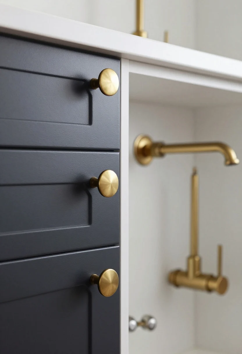
6. Builder-Grade Hardware And Fixtures
© 2025 AI Illustrator — Inspiration Only
Those super shiny cabinet pulls and basic faucet scream rental. They catch the light—and not in a good way.
Smart Fix
- Swap hardware: Replace knobs and pulls with matte black, brushed brass, or aged bronze. Mix knobs on uppers and pulls on lowers for a designer look.
- Upgrade faucets and showerheads: Choose clean-lined, modern profiles. Look for WaterSense labels to save water (and money).
- Coordinate finishes: Keep metals consistent across a zone for cohesion—bathroom, kitchen, entry.
Renter note: Save old hardware and reinstall before moving out. Your deposit will thank you.
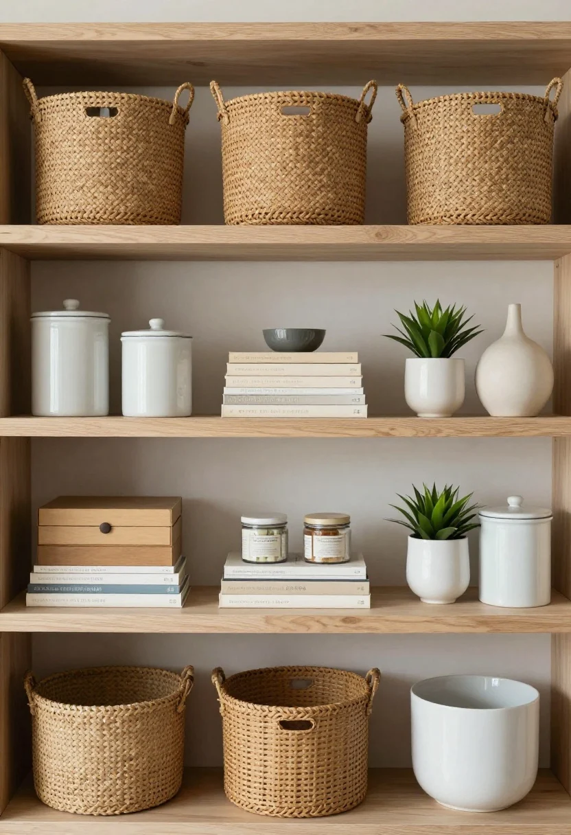
7. Cluttered Open Shelving
© 2025 AI Illustrator — Inspiration Only
Open shelves can look chic—or like a pantry explosion. If you can see every cereal box label, it’s giving dorm vibes.
Smart Fix
- Contain the chaos: Use baskets, canisters, and lidded boxes for the not-cute stuff.
- Style in thirds: Group in sets of three with varied heights: stack books horizontally, add a small plant, finish with a sculptural object.
- Repeat materials: Wood, ceramic, glass—repeat a few materials to feel cohesive.
Pro tip: Leave some negative space. Empty shelf inches make the rest look intentional.
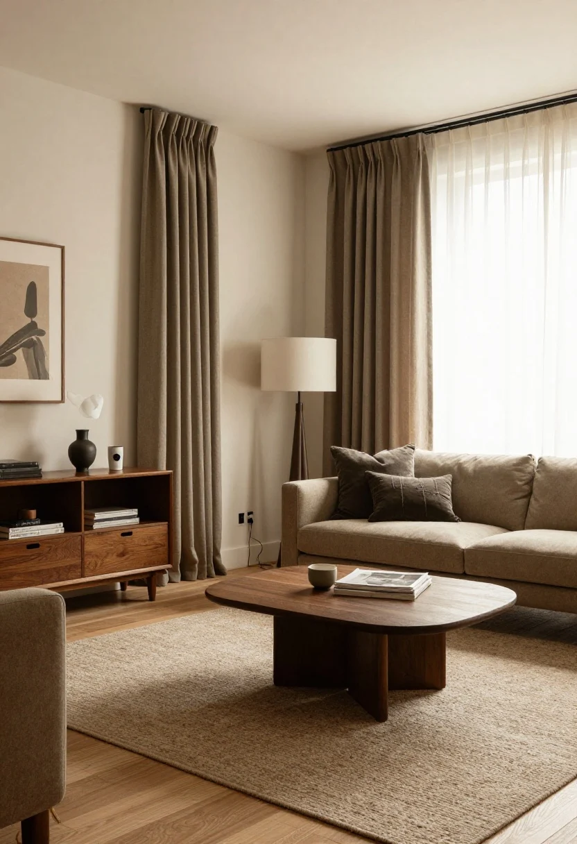
8. All-Gray Or All-Beige Everything
© 2025 AI Illustrator — Inspiration Only
Monochrome neutrals can look flat and cheap if there’s no texture or depth. It’s the decor equivalent of toast without butter.
Smart Fix
- Layer textures: Mix nubby linen, smooth leather, chunky knits, and raw wood. Texture = richness.
- Add undertone contrast: Pair warm beiges with cool charcoals, or vice versa, for dimension.
- Accent thoughtfully: Add a color moment—olive, rust, navy, or burgundy—via pillows, art, or a throw.
Paint cheat codes: Consider warm, livable neutrals like greige, stone, or soft taupe to avoid the “rental gray” trap.
9. Visible Cords And Clunky Tech
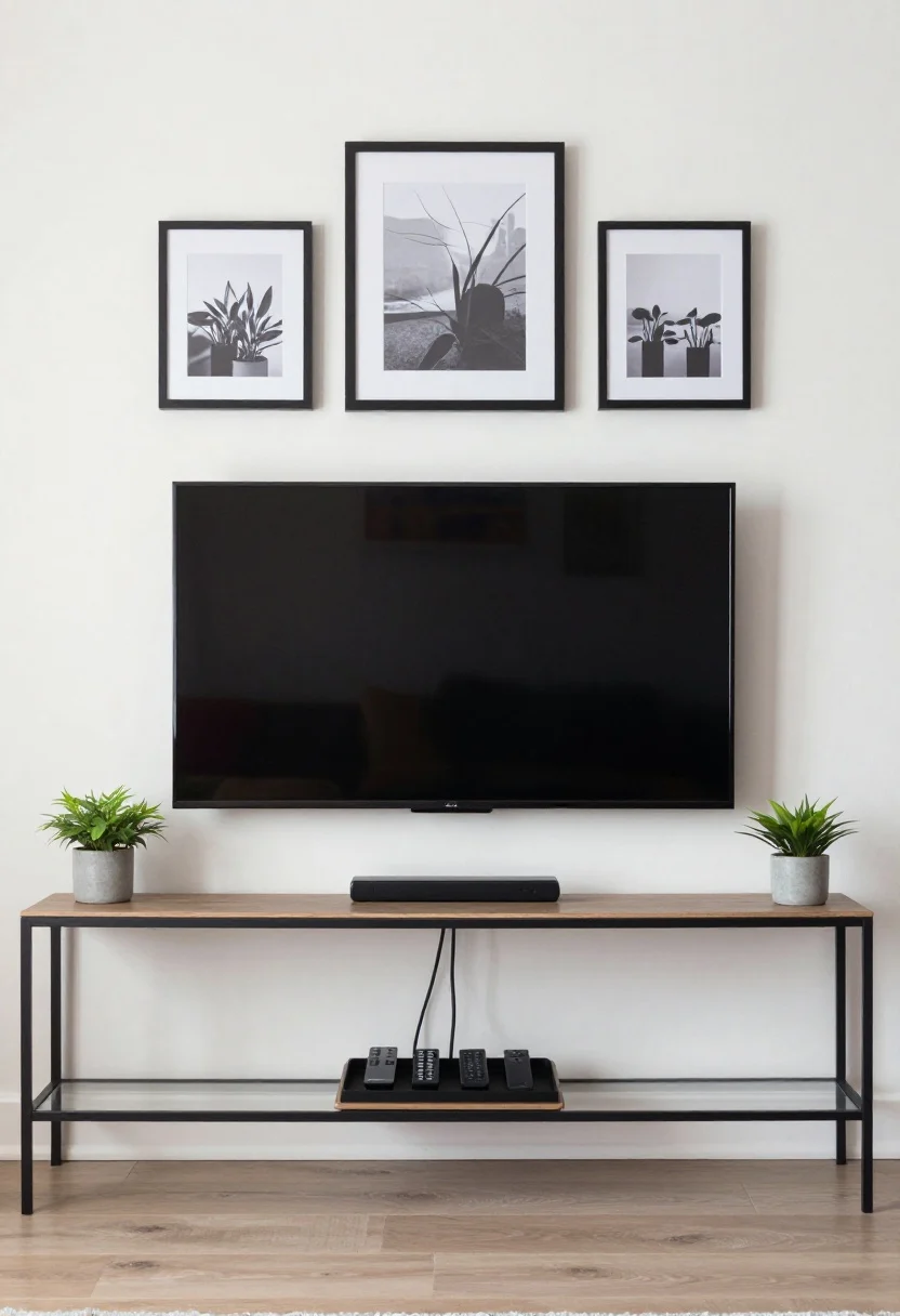
© 2025 AI Illustrator — Inspiration Only
Dangling TV cords and a tangle of chargers make a room feel chaotic. No one notices your beautiful console if Medusa’s hair is hanging underneath.
Smart Fix
- Hide the wires: Use cord covers painted to match the wall, raceways, or in-wall kits if allowed.
- Upgrade power strips: Choose slim, mountable strips under consoles and label cords.
- Contain remotes: Use a tray or fabric box. Add a small plant to keep it cute.
Bonus: Consider a Frame-style TV or add a simple frame around your mounted TV to blend with art.
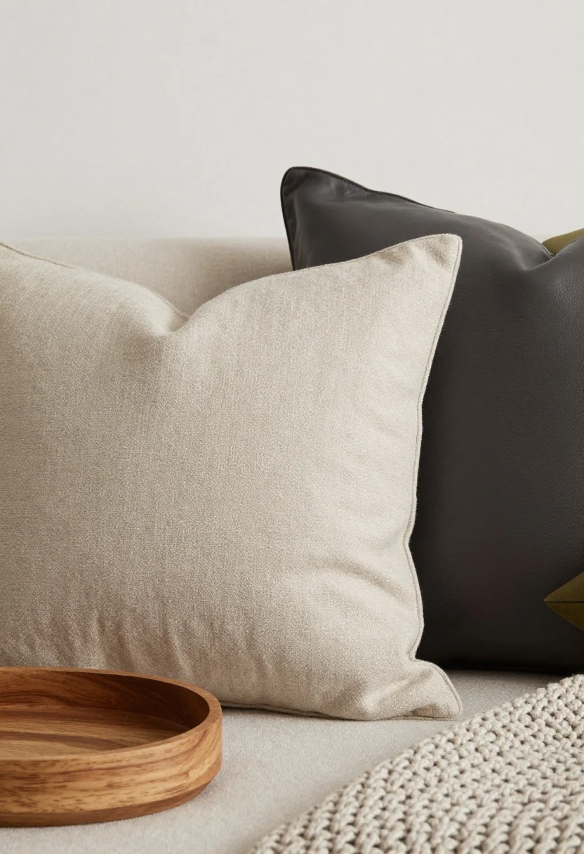
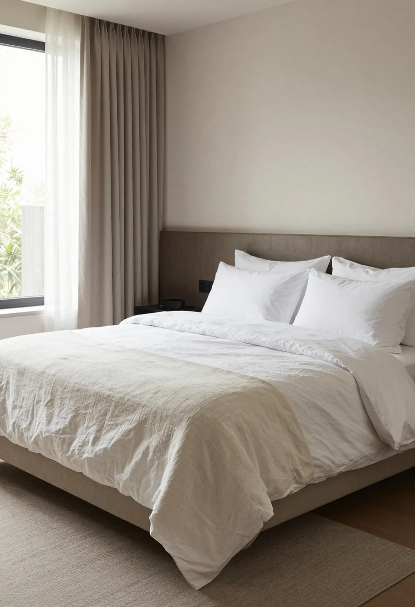
10. Paper-Thin Bedding And Flat Pillows
© 2025 AI Illustrator — Inspiration Only
A bed sets the tone for the whole apartment. If your bedding is shiny polyester with limp pillows, the room reads budget immediately.
Smart Fix
- Go for natural fibers: Cotton percale, linen, or bamboo blends breathe better and look luxe.
- Layer like a hotel: Use a duvet, quilt or coverlet, then two sleeping pillows + two Euro shams for height.
- Steam or fluff: Wrinkles cheapen the look. A handheld steamer is magic.
Color tip: Stick to a neutral base (white, ivory, oatmeal) and add seasonal pillows or a throw for variety without reinvesting.
11. Plastic Plants And Sad Florals

© 2025 AI Illustrator — Inspiration Only
Plastic-y greenery and stiff faux flowers tell on you from the doorway. They collect dust and read as fake even across the room.
Smart Fix
- Go real where possible: Snake plants, pothos, ZZ plants, and philodendron are low-maintenance champs.
- Upgrade faux wisely: If you must, choose high-quality faux branches (olive, eucalyptus) and keep arrangements simple.
- Use sculptural vessels: A great ceramic or matte vase elevates even grocery-store flowers.
Light hack: If your space is dark, try dried stems (pampas, willow, lunaria) for texture without upkeep.
12. Cheap-Looking Bathroom Staples
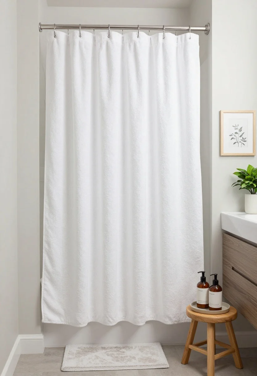
© 2025 AI Illustrator — Inspiration Only
Bathrooms age fast when the basics look flimsy—thin towels, plastic soap bottles, micro shower curtains, and cluttered counters all scream “temporary.”
Smart Fix
- Upgrade textiles: Plush, heavyweight towels in white or a calm neutral feel spa-level. Match your bath mat to your palette.
- Decant and elevate: Transfer soap and shampoo into uniform amber or clear pump bottles with minimalist labels.
- Shower curtain matters: Choose a weighted fabric curtain that touches just above the floor. Hang it higher to elongate the room.
- Add warmth: A small stool, a framed print, and a plant make it look styled, not sterile.
Renter upgrade: Swap the mirror for a framed one and replace the light fixture with a plug-in vanity bar if hardwiring isn’t allowed.
Conclusion: Small Tweaks, Big Upgrade
© 2025 AI Illustrator — Inspiration Only
You don’t need a total overhaul to ditch the cheap look. Focus on scale, texture, lighting, and the little details people touch and see daily—hardware, textiles, frames, and cords. Tackle one room at a time, and you’ll be shocked how quickly your apartment goes from “rental standard” to “who designed this?”
Start with the biggest eyesore, make one smart swap, and keep going. Your space will thank you—and so will everyone who visits and refuses to leave. FYI: That’s when you know you nailed it.